On Black n' Red premium writing pad (white paper)
Scroll to bottom of review for typed version of this!
Scroll to bottom of review for typed version of this!
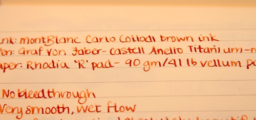
A close up of that color! (white paper)
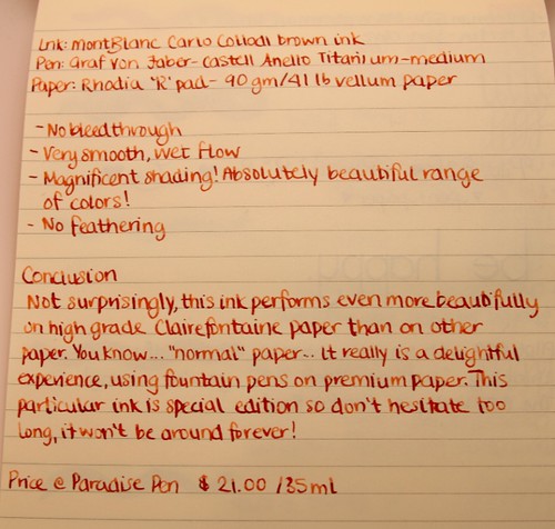
In Rhodia "R" Pad - Clairefontaine paper (ivory paper)
Check out that gorgeous shading and color! (ivory paper)
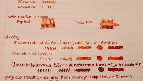
What is really incredible is how three different nibs result in such a big difference in the ink's appearance on paper. Some people prefer completely uniform inks and others really enjoy the variation. Personally, I LOVE flex nibs so I really enjoy experimenting with inks and seeing what happens with them using different nibs.
(White paper)
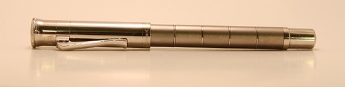
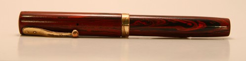
Graf Von Faber-Castell Anello Titanium - medium
Waterman 52V + 14K Waterman Ideal #2 wet noodle
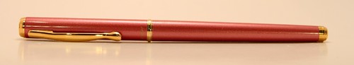
Pilot Cavalier - fine
Other reviews that may pop your top:Sam Capote via Fountain Pen Network
Price
Pen Boutique - $16.00
Paradise Pen - $21.00 (not listed online for some reason)
Overall
I think this is a really nice looking ink! Wonderful range of color, from orange-copper to chestnut brown, but can even be as dark as a dark brown if you're using a wet noodle! It behaves quite nicely on 'normal' paper such as the Black n' Red pad but is even more lush on Clairefontaine paper. I would recommend this ink because it's pretty and performs very well in every way.
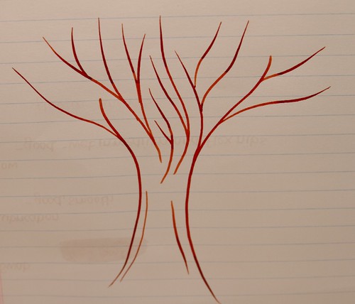
Flex pen tree
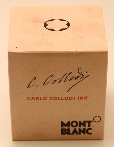
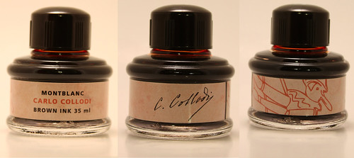
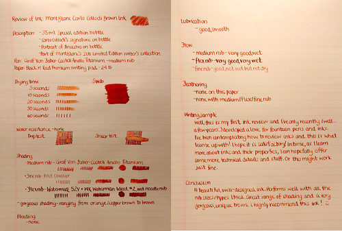
Review of Ink: MontBlanc Carlo Collodi Brown Ink
Description: - 35 ml Special edition bottle
- Carlo Collodi's signature on bottle
- Portrait of Pinocchio on bottle
- Part of MontBlanc's 2011 Limited Writer's Edition Collection
Pen: Graf Von Faber-Castell Anello Titanium - medium nib
Paper: Black n' Red Premium writing pad - 24 lb
Drying time Swab
5 seconds
10 seconds
20 seconds
30 seconds
60 seconds
Water resistance - none
Drip test Smear test
Shading
- Medium nib - Graf Von Faber-Castell Anello Titanium
- Fine nib - Pilot Cavalier
- Flex nib - Waterman 52V + 14K Waterman Ideal #2 wet noodle nib
- gorgeous shading - ranging from orange/copper brown to brown
Bleeding
- none
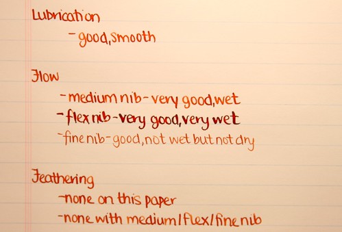
Lubrication
- good, smooth
Flow
- medium nib - very good, wet
- flex nib - very good, very wet
- fine nib - good, not wet but not dry
Feathering
- none on this paper
- none with medium/flex/fine nib
Writing Sample
Well,
this is my first ink review and I've only recently (well...a few
years...) developed a love for fountain pens and inks. I've been
contemplating how to review inks and this is what I came up with! I hope
it is satisfactory! In time, as I learn more about inks and their
properties, I can hopefully offer some more technical details and stuff.
Or this might work just fine.
Conclusion
A
beautiful, well-designed ink. Performs well with all the nib
sizes/types I tried. Great range of shading and a very gorgeous, unique
brown. I highly recommend this ink! :)