When I first began noticing fountain pens and ink, I was mostly attracted to inks because of, well... “oooo pretty...” and not for any real appreciation of the ink. I’m still a beginner in the world of inks and as I was thinking about how to do my first ink review, I wanted to be able to offer useful information for inkers who know what they’re doing (well... at least try to be useful...) and to provide a few pictures and various writing samples to give everyone an idea of what the ink actually looks like under different conditions (different pens, layers, papers). If you find something you disagree with or is incorrect, please tell me (without being horribly mean). Unfortunately, a lot of this stuff can be subjective and can vary so take it with a grain of salt! Okay, "disclaimer" aside, I hope you enjoy and/or benefit from my review!
On Black n' Red premium writing pad (white paper)
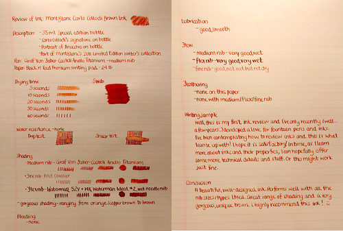
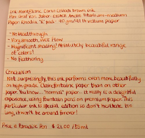
Scroll to bottom of review for typed version of this!
Scroll to bottom of review for typed version of this!
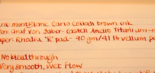
A close up of that color! (white paper)
In Rhodia "R" Pad - Clairefontaine paper (ivory paper)
Check out that gorgeous shading and color! (ivory paper)
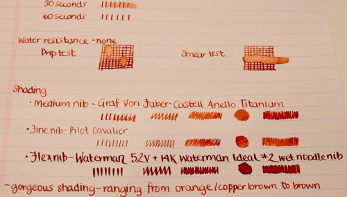
What is really incredible is how three different nibs result in such a big difference in the ink's appearance on paper. Some people prefer completely uniform inks and others really enjoy the variation. Personally, I LOVE flex nibs so I really enjoy experimenting with inks and seeing what happens with them using different nibs.
The three fountain pens used in this review are as follows:
Graf Von Faber-Castell Anello Titanium - medium
Waterman 52V + 14K Waterman Ideal #2 wet noodle
Pilot Cavalier - fine
Other reviews that may pop your top:Sam Capote via Fountain Pen Network
Price
Pen Boutique - $16.00
Paradise Pen - $21.00 (not listed online for some reason)
Overall
I think this is a really nice looking ink! Wonderful range of color, from orange-copper to chestnut brown, but can even be as dark as a dark brown if you're using a wet noodle! It behaves quite nicely on 'normal' paper such as the Black n' Red pad but is even more lush on Clairefontaine paper. I would recommend this ink because it's pretty and performs very well in every way.
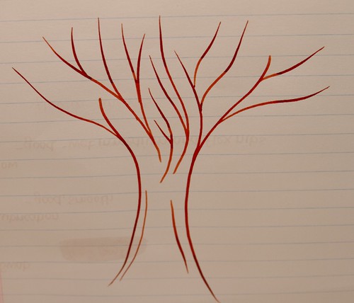
Flex pen tree
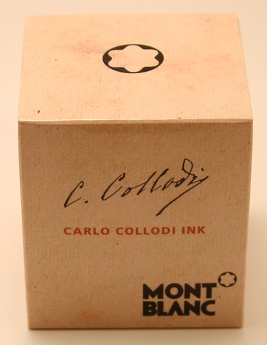
Review of Ink: MontBlanc Carlo Collodi Brown Ink
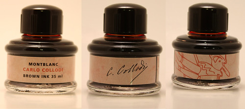
Description: - 35 ml Special edition bottle
- Carlo Collodi's signature on bottle
- Portrait of Pinocchio on bottle
- Part of MontBlanc's 2011 Limited Writer's Edition Collection
Pen: Graf Von Faber-Castell Anello Titanium - medium nib
Paper: Black n' Red Premium writing pad - 24 lb
Drying time Swab
5 seconds
10 seconds
20 seconds
30 seconds
60 seconds
Water resistance - none
Drip test Smear test
Shading
- Medium nib - Graf Von Faber-Castell Anello Titanium
- Fine nib - Pilot Cavalier
- Flex nib - Waterman 52V + 14K Waterman Ideal #2 wet noodle nib
- gorgeous shading - ranging from orange/copper brown to brown
Bleeding
- none
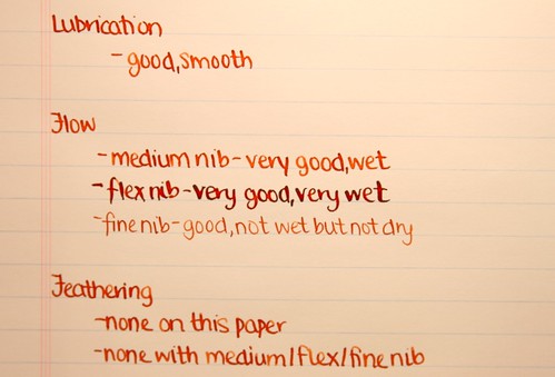
Lubrication
- good, smooth
Flow
- medium nib - very good, wet
- flex nib - very good, very wet
- fine nib - good, not wet but not dry
Feathering
- none on this paper
- none with medium/flex/fine nib
Writing Sample
Well,
this is my first ink review and I've only recently (well...a few
years...) developed a love for fountain pens and inks. I've been
contemplating how to review inks and this is what I came up with! I hope
it is satisfactory! In time, as I learn more about inks and their
properties, I can hopefully offer some more technical details and stuff.
Or this might work just fine.
Conclusion
A
beautiful, well-designed ink. Performs well with all the nib
sizes/types I tried. Great range of shading and a very gorgeous, unique
brown. I highly recommend this ink! :)



Wow, what a comprehensive review! Easily put any of my ink review in shame :) I like how you compare it using different pens. Too bad Mont Blanc does not work well with normal paper. In that department, I think Omas really outshines Mont Blanc. Anyway, thank you for a joy reading!
ReplyDeleteThis ink looks more redish in your pictures than on the FPN review. Very similar to Sheaffer's brown, which I must add is one of the inks I use the most. A very interesting color with superb shading.
ReplyDeleteThank you Shangching :) It's almost TOO comprehensive and I still missed saturation...whoops. Oh well, I'll learn for the next one. It's actually my first MB ink but I really only got it because of the color.
ReplyDelete@Kurazaybo - You're right.. mine does look a bit more red so I went and looked at the writing on the paper itself.. it still looks a bit red so I'm wondering if it's a batch difference or just the way I write. I write quite lightly/gently with fountain pens and it does seem to give me lighter shading than most people get. Thank you for your comment :)
Very nice review and I admit I have never heard of this ink (the color, not the brand).
ReplyDeleteI like how you used different pens and nibs. That matters a great deal because the character of an ink can change a lot depending on the nib and paper. Unfortunately I don't have the luxury of reviewing an ink in multiple pens.
@Peninkcillin - Thank you! I'd never heard of it either and only found it at Paradise Pen in a desperate search for a new ink. I couldn't decide on the Private Reserves/Pilot Iroshizukus then found this bottle nestled in with the other Mont Blancs! Thank you very much for your feedback about using different pens and nibs. I was worried that it may have just been too much information for a review and people would get bored reading it. I only recently acquired a variety of nibs to test with :) They are very fun though! (Especially that wet noodle.. my favorite!)
ReplyDeleteTremendous issues here. I'm very happy to see your post. Thanks so much and I'm taking a look
ReplyDeleteforward to contact you. Will you please drop me a mail?
Here is my page - direct download movies
I enjoy what you guys are usually up too. This type of clever work
ReplyDeleteand coverage! Keep up the fantastic works guys I've incorporated you guys to blogroll.
Here is my webpage cheap cigarettes online uk
Your style is really unique in comparison to other folks I have read stuff from.
ReplyDeleteMany thanks for posting when you have the opportunity, Guess I'll just book mark this site.
Here is my homepage ... expensive bolsos
This is a very good tip particularly to those new to the blogosphere.
ReplyDeleteBrief but very accurate information… Appreciate your sharing this one.
A must read post!
Here is my blog post air force zapatillas
When some one searches for his necessary thing,
ReplyDeleteso he/she wants to be available that in detail,
so that thing is maintained over here.
Take a look at my weblog :: シャネル販売
Hi, i feel that i noticed you visited my web site so i came to return
ReplyDeletethe favor?.I am trying to find things to improve my web site!
I assume its ok to make use of some of your concepts!
!
Also visit my homepage :: シャネル バッグ
Cheap Burberry Handbags These furnishings certainly are a good choice.
ReplyDeleteThe artist material moisture from the feet, ensure that is
stays cold and dry. What the majority are finding are imitation,
fake UGG Boots.
Here is my homepage: コーチ 財布
such a confusing ink. most reviews I've seen seem to a rusty brown, where as yours is more to an orange hue. I wish the ink was like yours instead...thanks for the review !
ReplyDeleteMine does look quite orange. Of course, when I took these pictures, I had a poor set up but even now, using the ink, it still has a very strong orange tinge to it. In very wet pens, it becomes more brown.
ReplyDelete