 |
From J. Herbin:
Today, Herbin inks are widely used and internationally renowned. To celebrate the 340th Anniversary of our founding, we are introducing the "1670" ink especially made for this event.
With a dark red color and earthy tone, it is a reminder of the historic color of the Herbin logo and the sealing wax used by the members of the royal courts.
The sealing wax on the bottle is reminiscent of the Herbin wax used for the "grand cru" wines of France.
The design on the box represents the life of J. Herbin, a sailor. The ship, anchor and palm tree represent navigation and discovery. The crown is a reference to the red sealing wax color used in the royal courts of Europe.
My bottle of J. Herbin’s Rouge Hematite anniversary ink arrived from Goulet Pens a few weeks ago. I actually had not read any reviews of it so I didn’t really go into this with any expectations other than my positive experience with other J. Herbin inks.
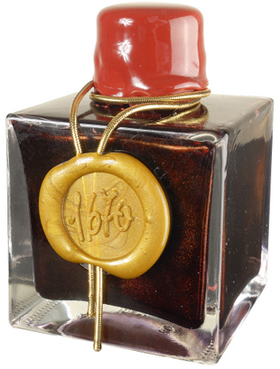
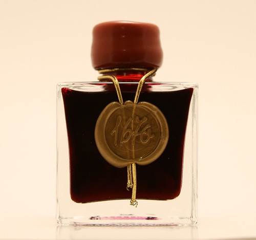
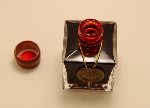
The packaging is very clean and pretty. The bottle is enclosed in a thick papered box with gold and red writing. Inside is a pamphlet with the history of J. Herbin. The 50 ml bottle itself is really awesome - tidy, defined corners, a red wax dipped cap, and 1670 stamped in the gold wax on the front, and a great view of the ink inside. In the bottle, this ink is a deep, glittery scarlet that is both majestic and elegant.
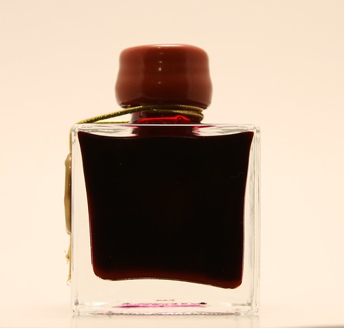
If you look under your bottle, you'll probably notice pigment does settle at the bottom of the bottle so give it a good shake to get that stuff mixed in before filling. Of course, this suggests the ink is very saturated, and it is!
See the settling? I think it looks so neat.
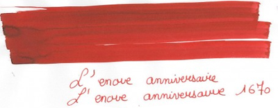
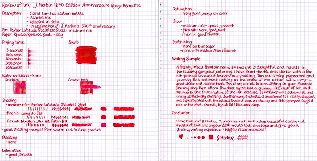
Good things:Once it hits the paper, you’ll see right away how incredibly saturated it is. The ink is an intense scarlet, earthy red. When you shake the bottle to mix the pigment, it swirls around and looks creamy and incredible.
It has great flow and lubrication, very smooth even though it looks and feels so thick. It performs very well on premium paper; no feathering, bleed through or show through in the Rhodia Reverse Book. Not surprisingly, it has really wonderful shading. Warm, orange-red to deep scarlet, never with brown tones that is sometimes mixed in with reds. This ink produces beautiful shading!
In areas where the ink is saturated or pooled (such as in the swab), there’s a yellowish green-gold outline once the ink is dry. I think it’s neat. You can really see this if you’ve got a broad or flex nib. However, you might not like it if you’re particular about your red ink being only red.
Things to be aware of? Don’t leave it in an unused fountain pen too long. Within a few days, it starts drying and after a few weeks, it becomes thicker and gummier (when damp) and flakier (when dry). It's not waterproof though, so you can clean that nib up with a good washing. I make sure to flush my pen every time I use it with this ink, even if I'm refilling with it again.
It is also a slow drying ink. Even one tiny little line from the drying time sample took well over 30 seconds to dry. I am not usually concerned with drying times for inks though as when I’m working with fountain pens and inks, I am willing to be patient. Be aware that with this kind of saturation, there is the chance of smudging and printing. If you look at the previous scan of the writing sample, on the left side page, you can clearly see the right page printed on to it. I left it to dry for at least 20 minutes and was not using a particularly wet pen. So again, be aware that your work will have to dry, especially if you are using premium paper and/or wet pens.
Furthermore, it is not waterproof! And with so much color, it will mess up whatever wet objects touch it and they'll require cleaning, too. Or it'll just turn your writing into a red puddle.
The mouth of the bottle is fairly narrow so you may have to work from another container. I always work with my inks from a small tube (the ink vials from Goulet Pens) to avoid contamination or major spilling.
Nevertheless, imagine how awesome your holiday cards would look in this ink! All these "flaws" (if we want to even call them that) are minor to me compared to the enjoyment from using an attractive ink.
Other reviews you’ll like:
East...West...Everywhere! (I love her water resistance example! So funny!)
PenInkcillin
Dizzy Pen
Lady Dandelion
Price
Goulet Pens - $20.00
JetPens - $20.00
Writer's Bloc - $19.00
Pen Boutique - $20.00
Overall
This is a radiant, well-behaved ink - if you don't mind the long drying time and subsequent concerns of smudging. It is great to look at on paper, and it is beautiful in the bottle as well. It would look really suave sitting on your desk at work (or home). Despite the drying time (which is really not a big deal because I play with a wet noodle and other wet nibs and it doesn't bother me), I highly recommend you pick up this special edition before it's gone - it's gorgeous!



5 comments:
FANTASTIC review! Thank you for the retailer and other review links too :D AWESOME!!!!
Thanks for mentioning me! Really appreciate it!
This ink is wonderful. I got a whole bottle too and I don't regret it. The only thing that puzzles me is what pen to use it in. I think it works best in some sort of calligraphy pen, flex pen or one that makes wide lines. It would be a shame to waste that shading on anything else.
My other problem is that I can't make myself use it. The bottle itself is a work of art.
Thanks Rori!! I'm so happy you liked it :) It's not as awesomely technical as some other reviews I've seen but I'm still a bit of an ink n00b hehe.
@Peninkcillin - I love your reviews and your blog is so useful and helpful to me. I've only dipped into this ink once and that was to portion some into a vial for this review and some doodles! Now you've got me wondering what it'll be like in a flex. It'll be hard to sacrifice that much ink for a flex pen but I'm going to have to try hehe
I did in fact use this on my holiday cards, and inside a Pilot Parallel pen. It's *awesome*. I wish it wasn't such a limited edition because I know eventually I'm going to want more of it.
Thanks for the excellent review!
Oh my goodness. I bet that looks amazing!!! *drool*
Post a Comment