The
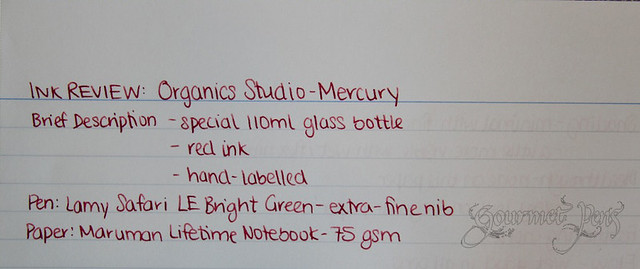
mercury red fountain pen ink is another one of the bottles I ordered from
Organics Studio. I had been looking for a red ink to replace my Noodler's Fox Red. While this one isn't the same shade of red, it's still a nice red to have in my collection... And then I realized I have many red-type colors in my
hoard collection hoard.
 |
| Just the intro... |
This is the second bottle of ink I purchased from
Organics Studio, in addition to the
uranium green I recently reviewed. The mercury shares a lot of characteristics and qualities with the
uranium green, which isn't too surprising. My favorite is that it is a wet ink - I love wet, flowing inks, even though I sometimes make a mess with them.
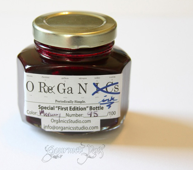 |
A pretty jam-like bottle. Actually, it totally looks like jam based on the color and shape. DO NOT EAT. In large quantities. Do not feed to your children and/or pets and/or annoying neighbors.
I love the hand labelling except it's rubbing off so I'll have to touch it up myself. |
I did note there were little crystals in the bottle, even after swirling the bottle around to mix up any settled pigment. I was concerned this would affect the flow or come out of the nib and leave behind crystals on the page but this didn't happen with any fountain pens. I assume the little crystals were just left behind on parts of the glass where the ink had sloshed around. Again, this reminds me of J. Herbin's anniversary ink. This has not affected the ink's performance and when I roll my converter, the ink moves freely, without any globs or chunks in it, so all looks well!
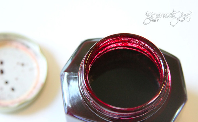 |
| Note the crystals on the mouth of the bottle. |
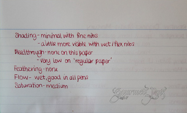
The ink is well behaved - no bleed through or show through on the Maruman Lifetime Notebook paper (75 gsm), and very little bleed through in a Staples sugarcane based notebook, despite the very thin paper! No feathering, and very good flow. The ink is only somewhat saturated.
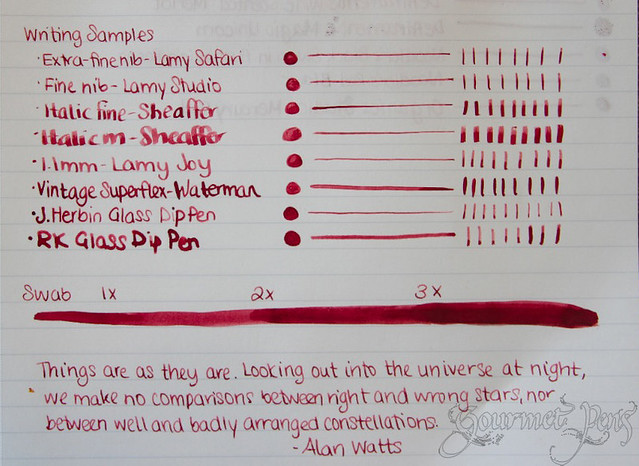 |
| My swab sucks. I've been trying to save the Earth and not use Q-Tips but my paintbrush appears to be a failure of sorts. |
The drying time is a good 30 seconds here because it's both a very wet ink, and the Maruman Lifetime Notebook paper is very smooth. Water resistance in this notebook is very low.
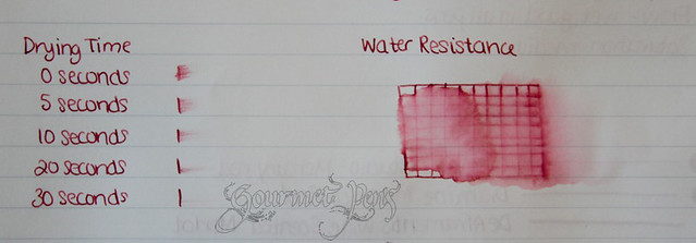 |
| I was surprised to note the ink is more water resistant on "cheaper" paper - in this case, the Staples sugarcane based notebook, which I absolutely love - rather than smooth/coated paper of Maruman's Lifetime Notebook. |
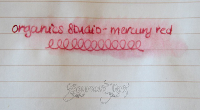 |
| Water resistance seems much higher in the Staples sugarcane notebook! |
 |
| I thought it was an interesting statement. And I believe very true! However, more importantly, notice how great the ink looks on the page - no feathering, no blobs or anything. Very pretty, and this is again on the thin Staples sugarcane based paper. |
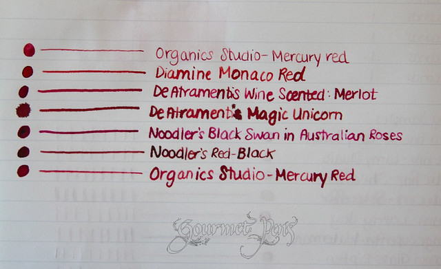 |
| Ugh. My apologies for my atrocious writing. Sore wrist this day and I was lazily trying to write to avoid further discomfort. This was done with a J. Herbin glass dip pen. The first sample of mercury red is written with a Lamy Safari EF nib, and the last with the same glass dip pen, to show the color difference with wetness. |
Follow Organics Studio!
Price
Overall
This Mercury Red ink is a really nice deep red - not light and bright red - but a darker, more elemental red. Get it? Elemental? ZING. As I mentioned, I love wet flowing fountain pen ink so this one is very suitable for me. It behaves wonderfully on both premium and regular paper, and in some cases, even better on regular paper. This ink is very easy to clean out of pens and not fussy to handle! A great red ink for when you want to use red but don't want it to look like a bunch of corrections! Plus, Organics Studio is a pleasure to deal with.


9 comments:
Your kind words make me blush! You're reviews are always so wonderful! Hope you're still enjoying that pink that we made you! :)
Oh, a lovely red ink! Do you get to write with ink? Here, I don't know why, it's seen as rude to write using red ink :(
I'm really happy the Goulets started carrying this line. I look forward to getting a sample of Cobalt from them :)
I have to admit, this new brand came out of the blue for me. The bottle is very cool and I love the handwritten numbering. From what I've seen so far the colors are also very nice.
Same here! One day Julie (O-Kami) mentioned then and I was like :| what is this?? Hehe. So far, I love all the inks, especially my special pink one. They behave REALLY well.
Really?? That would be sad. I have never heard of red being rude to write with - not here anyway. Perhaps it's cultural? I use inks for letters/journaling though when I was working, I used them in my lab book although I kept the colors fairly professional hehe. You will have to report in when you get some Cobalt :D
I'm happy you like them :D Next review is the PINK!!!!! WEEEE!! I love it... and refuse to share it hahahaha
Yup, I'd say it's cultural. Maybe from the times of the military dictatorship when anything red = communist. One of my old professors once told a story about how he had been laid off in the 70's for using red marker on a board.
Have you taken these ink bottle photos or they are stock ones?
I took these myself :)
Post a Comment