ABOUT
Size: 5.75" x 8.25" A5
Color: Blue
Ruling: Blank
Sheet Count: 50
Paper Weight: 100 gsm
Price: $11.50
Where to buy: European Paper
APPEARANCE
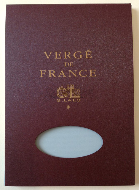
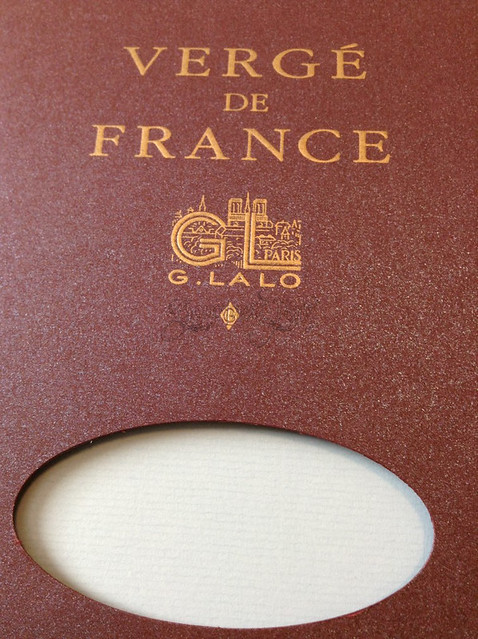
The G. Lalo Verge de France A5 tablet is, to put it simply, gorgeous. It is just a tablet, yes, but the cover is a pearlescent, metallic purple-blue. I can't even describe it properly, so you will have to look at the picture or close your eyes and imagine. The cover is just so pretty. The writing on it is gold embossed, and it's elegant and classy - I am keeping this cover when I run out of sheets. There is an oval cut hole into the cover that allows you to see the tablet inside. The sheets are glue bound at the top of the tablet, and it is very clean and tidy - no globs of glue and no ripped up/torn pages.
The pages themselves are also beautiful. In this case, the sheets are blue. The blue is what I think of as "little boy blue" - the color blue I imagine a little boy cat's color to be. Or a little boy's pajamas, whichever you prefer. I only have cats so that's what you get! You can see the lovely texture on the page. I'll get to that in a minute though.
PERFORMANCE & FEEL
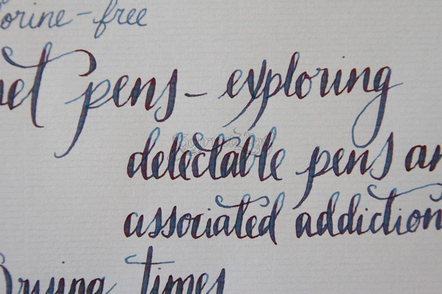
The texture on the page is something that must be brought up because it is really nice. This texture is actually because of the nature of "Verge" paper.. According to G. Lalo:
Verge refers to the grid of parallel translucent lines ("vergeures") that was formed in handmade paper as the sheets were laid to dry (the origin of the term "laid finish.")"When you run your fingers across this page, you can feel those lines - they're not sharp and edgy - but they give the impression of handmade paper. When you write on them, your pen doesn't catch and tear the paper, rather it gives feedback as you write over them, and makes the writing experience wonderful. The finish of the paper is fine laid. Normally with blank pages, I have a hard time keeping my lines straight (don't laugh) but the grids that are formed during the production process offers the perfect writing guide.
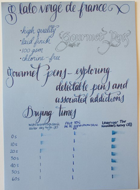
How does this paper perform? First off, let me just say: don't waste this paper using gel pens or ballpoints, please. This stuff is made for fountain pens. It is very fountain pen friendly - there is no bleed through, no show through (under normal use - I saw none anyway), and no feathering.
I always test papers using fine nibs as well as broad nibs, and wet flex nibs, in addition to a Pilot Parallel 6.0mm nib which is quite wide but not as wet as a flex nib. The paper handled all these pens easily.
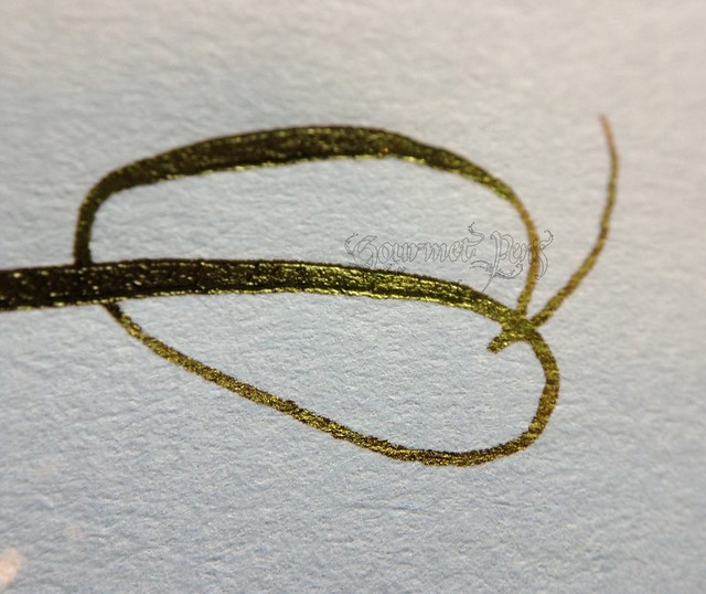
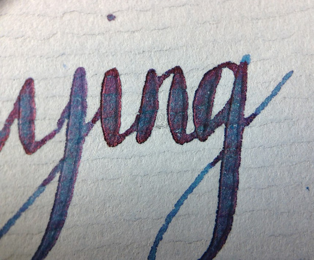
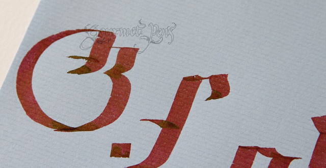
Drying times were quite decent and on the fast side relative to other fountain pen friendly papers. The sheen on Sailor Sky High and Grenade ink was visible - not as obvious as it may be on lighter colored paper - but it's there! Woo hoo! Three shades of sheen below:
The only downside I can note is with wide nibs such as the Pilot Parallel 6.0mm, complete coverage is hard to achieve because of the textured paper. This can be avoided by writing slowly and carefully.
PROS
- Matching envelopes also available.
- Six colors of paper to choose from.
- Elegant and sophisticated.
- High quality paper.
- Complete coverage is hard to achieve on textured paper when using wide nibs such as the Pilot Parallel 6.0mm nib.
I am so thrilled I finally got to try this gorgeous stationery. I am totally hooked and this will absolutely become part of my stationery/pen pal correspondence rotation. Beautiful, elegant, affordable, obtainable, and wonderfully fountain pen friendly! Highly recommended! I must now pick up a tablet of every other color, of course. Good thing I write 30+ letters a month, isn't it?
This tablet was provided to me free of charge for reviewing purposes. I was not compensated monetarily for my review. All opinions remain 100% my own!







6 comments:
What is InCoWriMo?
Oh, yeah, this paper is awesome. I have a white tablet and LOVE it. :) Thanks for the review!
InCoWriMo = International Correspondence Writing Month! It was in February - a month of writing letters to anyone of your choice - check it out! http://incowrimo.org
It was a blast :) Maybe you'll be interested for next year?
Oh I'll bet the white tablet is gorgeous. Yummy. That's next on my list!
Thanks for the review! I had just seen these in the store, but wasn't sure about the quality. I agree with you - I think they're beautiful!
You're welcome :) Thank you for taking the time to comment! I hope you will pick some up and enjoy it as much as I do!
Post a Comment