ABOUT
Brand: Sheaffer
Model: Sagaris
Body Material: Lacquer
Trim: Chrome
Length (capped): 132mm
Length (uncapped nib-end): 118mm
Length (posted): 147mm
Barrel Diameter: 10.5mm
Section Diameter: 9.25mm
Nib material: Steel
Weight: 31 g
Barrel design: Round
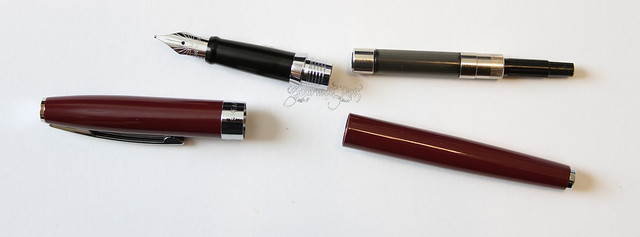
Fill type: Cartridge/converter
Price: £41.67 excluding VAT
Where to buy: The Pen Company
PACKAGING
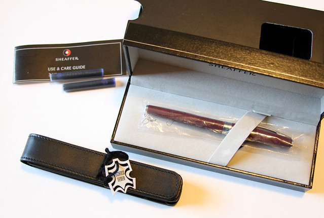
Simple packaging on this pen - a Sheaffer box in a sleeve. Inside the box, the pen was nestled in a felt bed, held down by a felt strap. Under the felt bed is the Sheaffer booklet with two cartridges, in addition to the converter supplied with the pen. It's a sufficient box, but not one I will be keeping. It takes up far too much space.
The Pen Company also sent this leather pen case that is quite handy. Um.... I need pen storage. Mine is shameful.
APPEARANCE
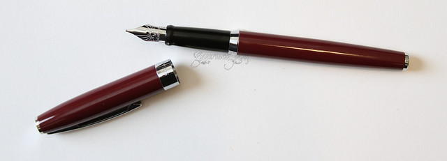
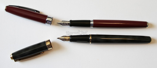
The fountain pen (and rollerball pen) comes with a tapered push-fit cap and the classic gloss black grip section. The wine, chrome, and black combine well and look great together, which is why I was attracted to the wine colour in the first place. The wine is a solid wine colour with a gloss on the body. The clip has the Sheaffer white dot on it.
I very much like the taper to the cap and barrel. I am fond of this shape in pens, even if it's just slight, so the Sagaris has me there.
The Sagaris is also available in chrome and black, if wine isn't your colour.
NIB & PERFORMANCE
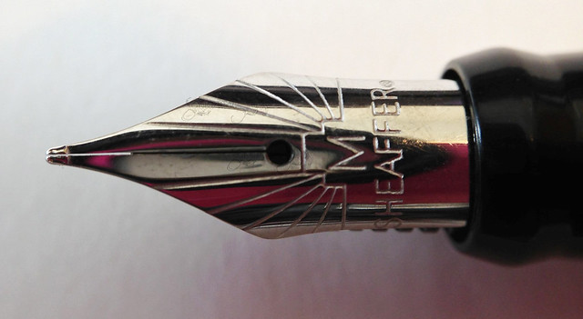
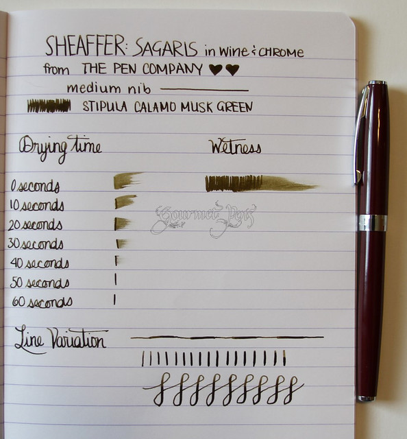
The pen wrote right out of the box - no flushing was necessary. The nib is a solid medium and is quite stiff. There is little line variation obtainable without serious pressure. This is not feasible when writing, so I will stick to my conclusion that it is a stiff steel nib. It is decently smooth though, which surprised me - there was a little feedback but to the extent that I liked it, especially on very smooth paper. It is not a wet nib - it lays down a good line of ink without gushing. Personally I prefer wetter pens so this nib might need a touch of work, but for most users, I think they would be pleased. Unposted, the pen is very comfortable to write with and my writing was uniform and consistent.
IN HAND
This Sheaffer Sagaris feels quite solid and durable in hand. It is much more slender than I was expecting. It feels slightly thin in my hand, especially at the section which thins out, compared to the barrel. However, the weight is comfortable and nicely balanced when unposted, which is how I chose to write with it. Posted, it becomes top heavy and not particularly comfortable for my hand. I suspect users with larger hands won't have issues with posting and the weight.
PROS
- Accepts Sheaffer cartridges or converter.
- Writes right out of the box.
- Well-balanced pen,
- Suitable for smaller hands unposted, and larger hands when posted.
- Cap clicks on very snugly. I love it. (FPGeeks loves it too.)
- Classic appearance. I like it.
- If you really like to post your pens and you have small hands, it may be difficult - it becomes top heavy.
- Dislike the grey converter body. Ink is still visible but I don't understand why it's grey.
The Sheaffer Sagaris is a very nice pen, especially in its price range. It offers a reliable, solid nib in an attractive body, at a very decent price point. Just over that of the Lamy Safari, giving you a more elegant pen. I also like that there are other colour options available, all of which are quite professional and tasteful. I had a very positive experience with the Sheaffer Sagaris (and the lovely Pen Company, as always), therefore I can happily recommend both to you!
Follow The Pen Company
Browse
Google +
This pen was sent by The Pen Company for review. I was not compensated monetarily, but I am spoiled rotten and get to keep this delectable thing. All opinions here are 100% my own, cross my heart.






6 comments:
Great review thanks. Love the red with the chrome furniture. Wonder why they changed the clip style and the bands on the black vs. the red. I think I'm reading they are the same model pen.
Off topic, but how do you like the Verde Muschiato ink?
I liked it at first but now its too bland. I paired it up with Terra di Siena but even combination with that is kind of stale. The colors don't pop.
And they both get pretty close to black if you let them sit in the pen for a while.
Also the ink is quite sensitive to any natural hand oils that may appear on the paper through normal contact.
I'm still looking for a good partner for this ink. A color that goes well with it aesthetically.
Thank you Bob! I suppose they are just trying to change the model to stay "stylish" hehe
Interesting - so far I LOVE the ink, but I currently am using it in a juicy BB stub nib, which is helping to bring out its shading more. It's a Pelikan and hasn't dried out or anything yet. I'll keep an eye on it. I am intrigued if it'll change, though I suspect it won't in the Pelikan.
I'm using this ink in a Stipula Vedo pen with a 1.0 mm italic nib. And it goes dark very frequently, due to dry-out most likely. I then have to drip water onto the feed with a medicine dropper to irrigate the nib and help the flow and cause the colors to true up again, and not be so dark.
Maybe I'll pair it up with Diamine Red Dragon.. oooh that sounds dark and mysterious together.
I'm running the risk of my page looking christmassy though :)
That's a nice looking pen. Especially in the red color.
Post a Comment