This is one of those pens I knew was stupid to buy, but I it was pretty, and I liked it.
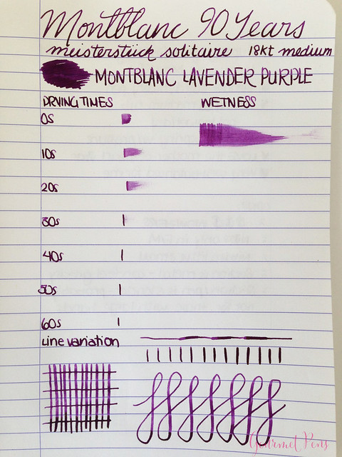
UPDATE: Sorry! I forgot the writing samples! I put them in the wrong folder... ahhh...
ABOUT
Body Material: Lacquer/Guilloché
Trim: Red gold-plated
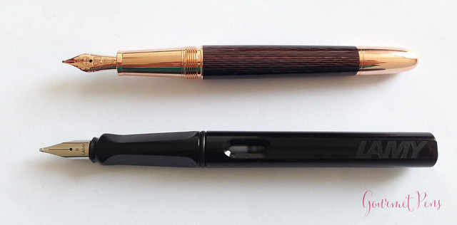
Length (capped): 139.7 mm/5.5''
Length (uncapped nib-end): 122.3 mm/4.81''
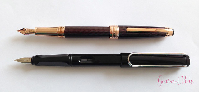
Length (posted): 155.0 mm/6.10''
Barrel Diameter: 10.3 - 11.7 mm/0.40'' - 0.46''
Section Diameter: 8.3 - 10.3 mm/0.32'' - 0.40''
Nib material: 18k red gold
Weight (all): 50 g
Weight (cap): 14 g
Weight (body): 36 g
Fill type: Cartridge/Converter
Price: $1,535.00USD
Where to buy: La Couronne du Comte (sold out model)
PACKAGING
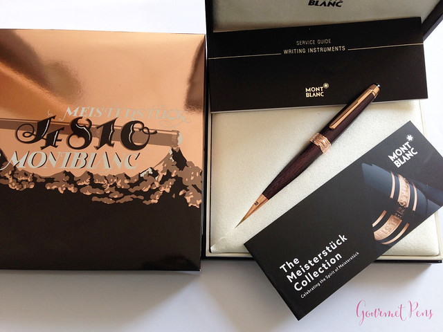
Not the most thrilling packaging! There was a shiny cardboard sleeve with the 90 year anniversary design. Inside, there was a clamshell box, that opened up to reveal the pen nestled in a beige, felt bed. Included was a Montblanc converter, along with a service guide and information on the Meisterstück collection. I don't like to keep my packaging, so I am kind of glad that this wasn't elaborate and tempting to keep, but for those who do like packaging, I wonder if this is adequate to match the pen.
APPEARANCE
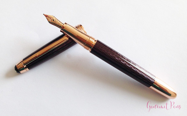
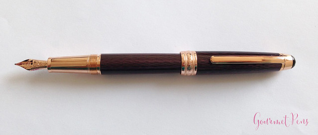
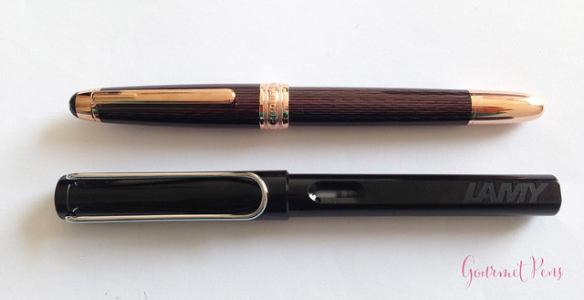
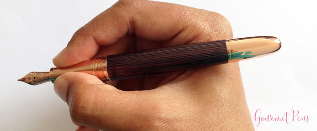
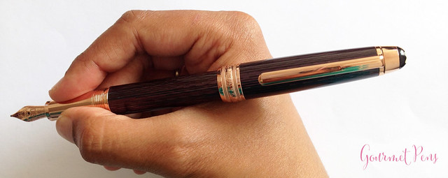
I admit it. I saw this in a store and just wanted it because it was glittering. I did try it before buying, and I loved how it looked in my hand. The Classique is more slender than the 146 and the 149, but the shape is similar - a thinner cigar shape with rounded off ends. It wasn't the shape that caught my eye as much as the finish.
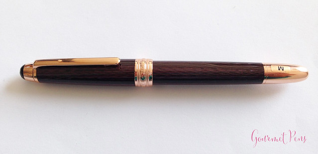
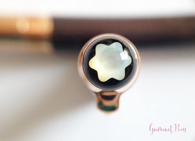
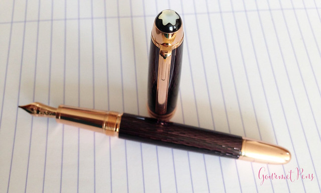
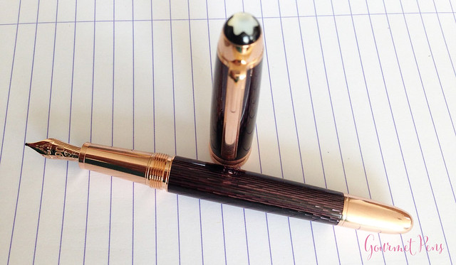
The finial has the Montblanc star, only this one is a beautiful, shimmering mother of pearl (that I wish they would put on all their pens). The clip, center band, section, and end of the barrel are all red gold. The center band is engraved with Montblanc Meisterück. Simple and elegant.
There is also a serial number engraved on the finial lip. The clip is attached externally, sitting close to the cap, and is an aesthetically appropriate width and length. I like how it looks.
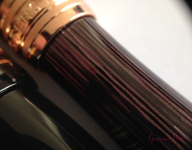
The section is fairly long, tapering slightly towards the nib, ending in a flared ridge. There are metal threads at the top, before the barrel joint. The cap and barrel are really lovely. A black lacquer is layered over an intricate, elegant guilloché engraving. The engraving glitters as the pen rotates in light. It looks like it should have a bumpy texture, but the lacquer over the guilloché is smooth and shiny. The combined effect of the guilloché, lacquer, and rose gold trim is beautiful (to me, anyway. I love shiny things. I also realize this won't appeal to everyone.). I like the smooth, sleek shape of the Classique as well. I like really small pens and I have fun with over sized pens, too, but this is a normal pen.
Back to that emblem: i love it. It has so much more depth to it than the resin emblem. I love how it looks blue, pearly white, green, and purple, depending on the light.
NIB & PERFORMANCE
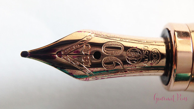
The medium nib is a 'hand-crafted 18kt red gold nib' (according to Montblanc). It has a single slit and a breather hole, along with the special 90-year design.
It writes a fairly wet medium line, which suits my preferences. I did not experience skipping mid-stroke, but I did experience more hard starts than I like. Even though it's a round medium, the sweet spot on the nib is quite small, so any deviation from it leads to hard starts. There is a generous amount of nicely-shaped tipping on this nib that's just begging to be ground to an italic.
I really enjoyed the feeling of the nib. It wasn't the buttery smooth type, instead, it offered a little bit of feedback. It was a little soft, yielding as I wrote normally, and holding up decently to some pressure. Certainly not a semi-flex, but a yielding nib is something I enjoy.
My overall writing experience was positive. The sweet spot is small, but since I have figured out where it is, it works well. I don't think this is a nib that will satisfy a lot of people, and I think Montblanc could have done a better job tuning it. A nibmeister is in order to perfect this one.
IN HAND
This clip is just right: it has what I like to consider an easy slide mechanism on the end, to easily slide it on to papers, into pockets, or into pen pouches. It's also moderately springy - not too loose, not too tight; it's just right.
The section threads are far back enough on the section that they aren't a bother. Metal section? Yeah. I did not find the section slippery, even during long writing sessions. I ended up readjusting my grip frequently due to the weight of the pen anyway. Perhaps this frequent readjustment (shifting my grip) allowed me to get around what may be a slippery section. I don't know, since I didn't experience slippage.
However, as I just mentioned, the pen is not all that light. The cap does post, deeply and securely by friction, but it was too heavy for me to use that way. Unposted, the pen is solid enough. It's not too long or too wide, and it's very well-balanced. It's just a solid pen. As a result, my writing sessions with it are capped at an hour or so.
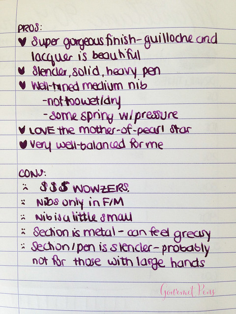
PROS & CONS
OVERALL
Underhelming packaging. Too expensive. Small sweet spot. A bit heavy. However, I think it's beautiful, and since I got it, I take it with me almost everywhere and use it constantly. I'm definitely going to get this nib tuned, to make it perfect.

No comments:
Post a Comment