A review of the new and intriguing Montblanc M - available as a fountain pen, art fineliner, ballpoint, roller ball, and screen writer. Thank you to Appelboom Pennen for lending me this pen to check out!
ABOUT
Body Material: Resin
Trim: Platinum-plated
Length (capped): 137.8 mm/5.42
Length (uncapped nib-end): 124.1 mm/4.88''
Length (posted): N/A
Barrel Diameter: 9.4 - 11.7 mm/0.37'' - 0.46''
Section Diameter: 8.5 - 9.5 mm/0.33'' - 0.37''
Weight (all): 28 g
Weight (cap): 6 g
Weight (body): 22 g
Nib material: 14kt gold
Fill type: Montblanc Cartridge only (according to MB, but read on)
Price: € 500,00 (excluding VAT: € 413,22)
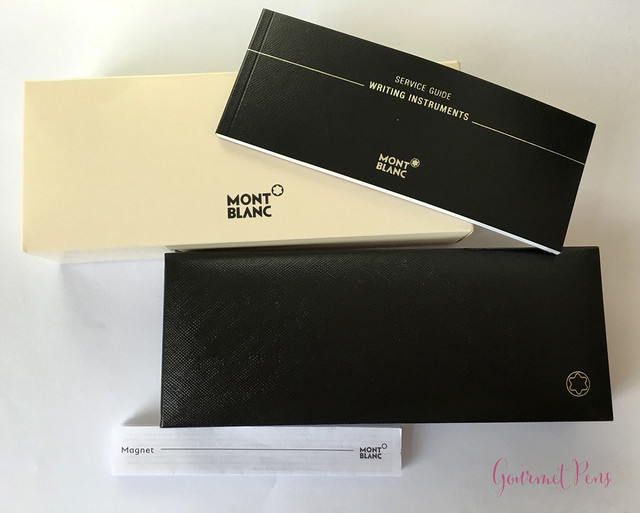
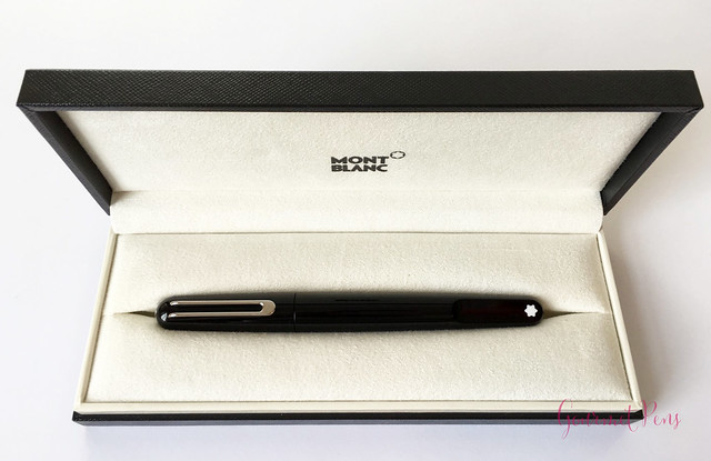
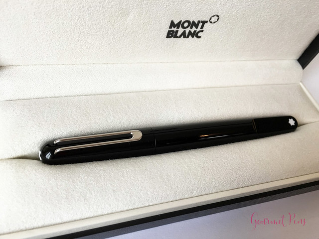
The M is minimally packaged and presented. In general, I find Montblanc's packaging lack luster, so it's not my favorite, but as usual, it does the job. I actually like simple packaging though, so lack luster is not necessarily a terrible thing. For starters, there is a cream outer box with the Montblanc logo in the middle. Inside, there is a Montblanc service guide - useful especially if you are not sure how to use or fill your pen. The pen is housed in a hard, black, clamshell box. It has a bit of texture to it, and there is a silver-outlined snowcap logo in the bottom corner.
The pen was nestled in a velvety, soft, cream-colored bed. I really like how simple this box is, and how little space it takes up. For me, when it comes to pen packaging - the less, the better. This is certainly not ornate packaging, but I don't care. Really, the less, the better!
APPEARANCE
The Montblanc M was designed by Marc Newson, so it is different from the classic designs of the 144, 146, and 149. To be honest, I had no clue who Marc Newson was. He must be a special designer to have been bestowed with the privilege and honour of designing a pen for Montblanc.
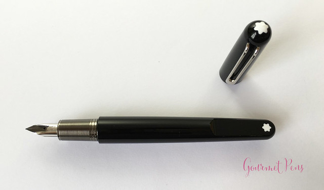
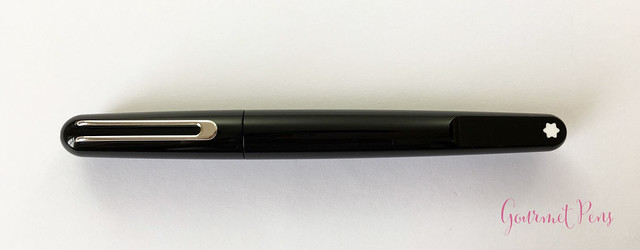
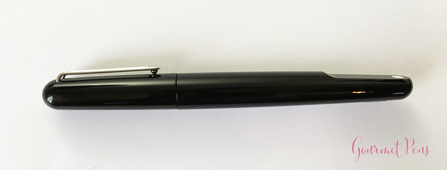
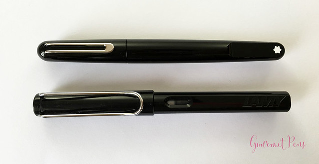
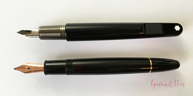
This pen is a smooth, round pen made of black precious resin. It looks more comparable to the 146 in size, rather than the 149. The back half of the barrel is flattened on one side, where the Montblanc snow cap logo is displayed in white. With regard to the logo being placed there, Marc Newson said,
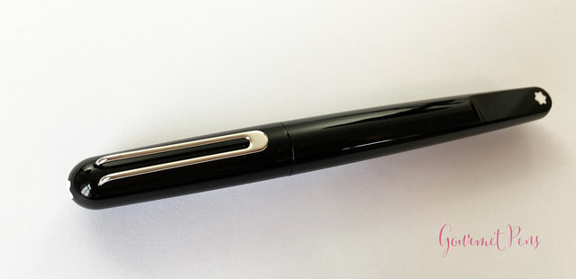
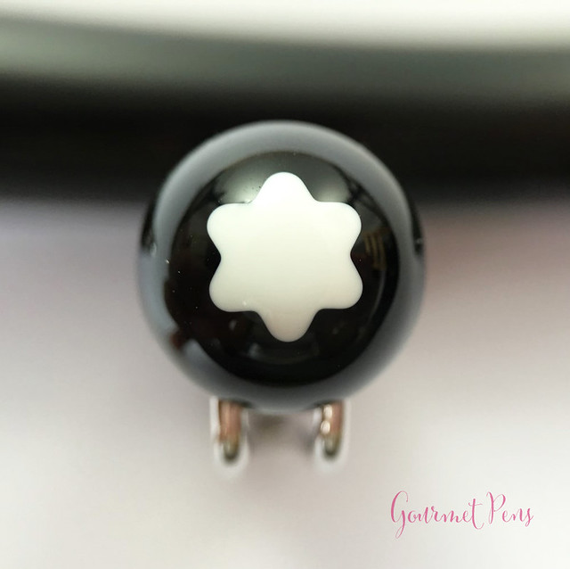
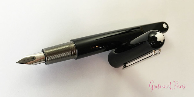
The finial is rounded off, and also has the snow cap logo on it, in white. The platinum-plated clip is attached internally, through small, very clean openings - nice attention to detail there. It is not solid; it's composed of two bars that meet at the end. There is a ball at the bottom, on the end. A serial number is engraved into the side of the clip, and it's very tiny!
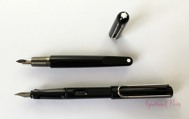
The barrel is round and smooth, which I like. It seamlessly glides into the flat plateau at the end. The section is also round, and is relatively short. It is ruthenium-plated and has fine ribbed rings around it. There is a bit of a step from the section to the barrel.
When the pen is capped, the clip always aligns with the logo on the flat face. That's a pleasant touch.
This design will certainly not appeal to everyone. It's a clean, simple look that I don't mind so much. I prefer Montblanc's classic-style clips. I'm also not crazy about the section. I like the little flat plateau. It's different, but not too wacky. Its a pretty pen, and if I stop comparing it to the more classic 146/149, I actually find myself liking it.
NIB & PERFORMANCE
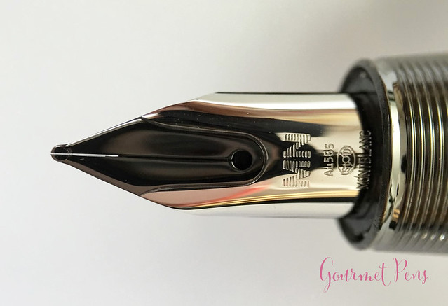
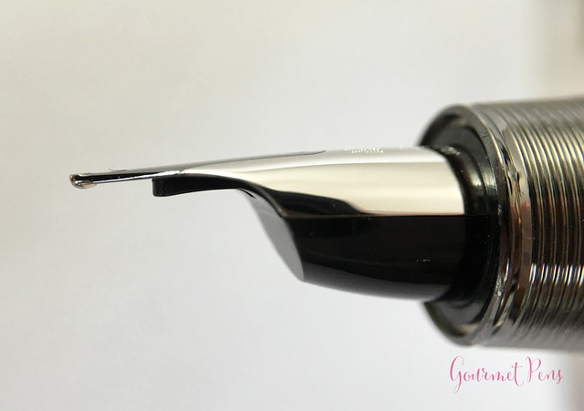
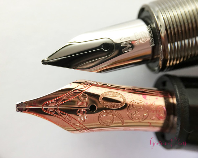
This 14kt gold nib is rhodium-plated and has a ruthenium inlay along the slit. Achieving this look is apparently quite complicated. First, the entire nib is rhodium-plated over the yellow gold. Then it is lacquered around the part that will have the ruthenium inlay, but because ruthenium doesn't adhere to rhodium, it is coated in yellow gold again, and then the ruthenium-plated is put over top. That seems a bit silly and unnecessary and probably could be done more efficiently, but alas, there you have it.
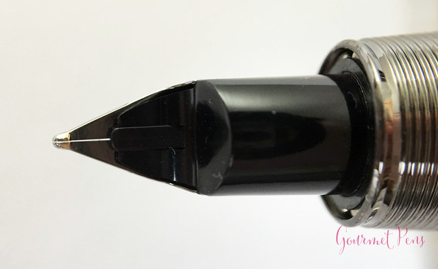
This nib is a fine. It has a singe slit and a round breather hole. It has a few markings on it - MN, the gold hallmarks, and Montblanc. As usual, the nib grade is not indicated on the nib itself. The sides of the nib fold around the rather round plastic feed, which is fin-less.
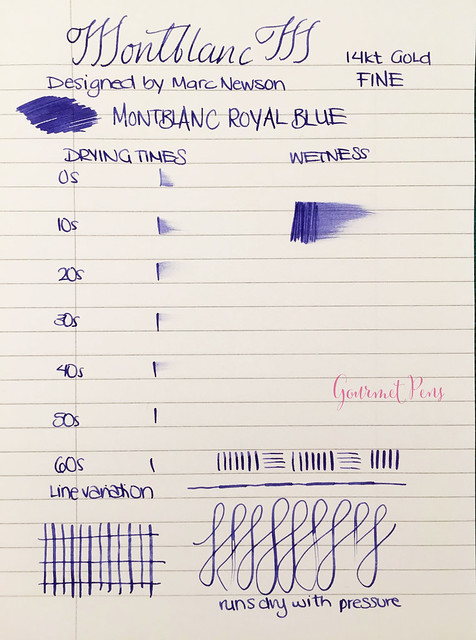
This nib is a pretty firm nib - when writing with it, there is very little give to it. That's not my preferred nib sensation. It does, however, write without issue - no skips or hard starts, and with consistent ink flow. I find it of medium wetness, with fairly average drying times.
Although it feels quite firm, with some (moderate) pressure, some line variation is possible. The feed tends to run dry under these conditions, though. A good nib for the regular paper that tends to be in offices, for work, or for those who like harder nibs.
The nib also offers some feedback, so I wouldn't call it super smooth. It's not scratchy, it's well-adjusted, but I like smoother, softer nibs in general.
The cap is magnetic, which is always a fun thing to play with at work. The clip automatically spins the cap so it aligns itself with the logo on the flat facet of the barrel. If placed on the wrong spot, the opposite polarities of the magnet can repel the cap and it may launch across the room if you're not holding it!
IN HAND
The new clip on this pen is fairly small. I find it quite stiff and the ball at the end makes it really difficult to get this one out of anything that doesn't sit under it (such as the elastic of a pen case).
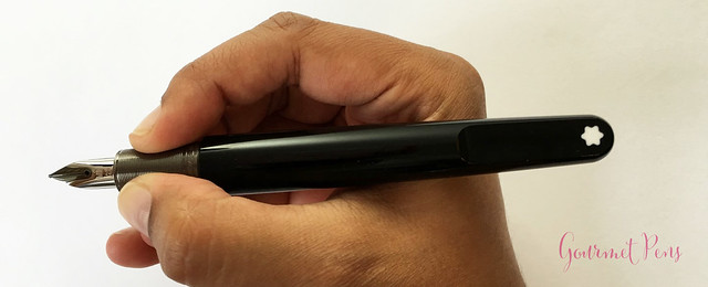
The section is not really my favorite either. The rings on it are smoother than I expected, and I find it slightly slippery during longer writing sessions. The ridge to the barrel is fairly large, but it isn't sharp; it is noticeable if you grip that high up. It's okay, it does the job, but it's not my favorite.
Unposted, I do find the pen pretty comfortable. It's not too heavy, it's well-balanced, and it's warm in my grip. The section is not slippery during shorter writing sessions. The cap cannot be posted. It can sit on the end of the barrel, but it's loose. As such, you can really only use this pen unposted.
Compared to the 146, which I find very comfortable in hand, the M is not as comfortable for me.
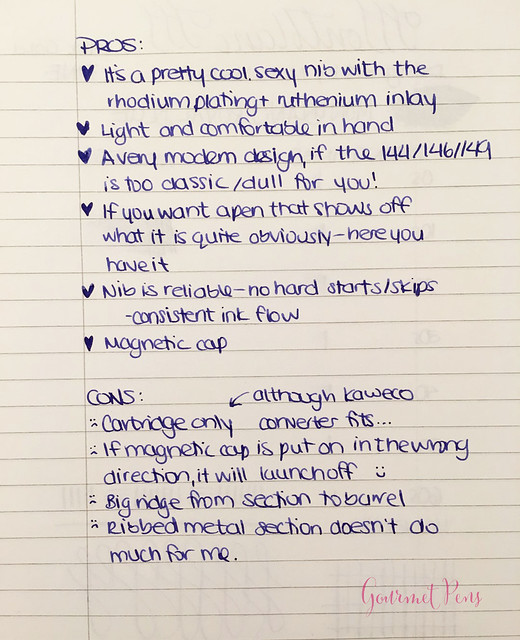
PROS & CONS
OVERALL
I have mixed feelings about this pen. First, yes, I know it's overpriced. Anything Montblanc comes with a huge premium. The design of this pen is kind of cute, and I think it's pretty. I don't think it's a classic, everlasting design, but it isn't hideous. At least, not to me. I don't like the clip that much, but I like the size of the pen. I think the nib is really cool-looking, but it isn't my favorite in terms of writing experience. There are so many feelings! It does write reliably, but I hate when pens that are not pocket pens are cartridge-only. I've put a Kaweco converter in this (the large version, not the squeeze one), but it still irks me.
This pen was loaned to me by Appelboom Pennen. I was not compensated monetarily for my review. Everything you've read here is my own opinion.
Body Material: Resin
Trim: Platinum-plated
Length (capped): 137.8 mm/5.42
Length (uncapped nib-end): 124.1 mm/4.88''
Length (posted): N/A
Barrel Diameter: 9.4 - 11.7 mm/0.37'' - 0.46''
Section Diameter: 8.5 - 9.5 mm/0.33'' - 0.37''
Weight (all): 28 g
Weight (cap): 6 g
Weight (body): 22 g
Nib material: 14kt gold
Fill type: Montblanc Cartridge only (according to MB, but read on)
Price: € 500,00 (excluding VAT: € 413,22)
Where to buy: Appelboom Pennen (the 10% discount code does not apply on Montblanc - Montblanc rules!)
PACKAGINGThe M is minimally packaged and presented. In general, I find Montblanc's packaging lack luster, so it's not my favorite, but as usual, it does the job. I actually like simple packaging though, so lack luster is not necessarily a terrible thing. For starters, there is a cream outer box with the Montblanc logo in the middle. Inside, there is a Montblanc service guide - useful especially if you are not sure how to use or fill your pen. The pen is housed in a hard, black, clamshell box. It has a bit of texture to it, and there is a silver-outlined snowcap logo in the bottom corner.
The pen was nestled in a velvety, soft, cream-colored bed. I really like how simple this box is, and how little space it takes up. For me, when it comes to pen packaging - the less, the better. This is certainly not ornate packaging, but I don't care. Really, the less, the better!
APPEARANCE
The Montblanc M was designed by Marc Newson, so it is different from the classic designs of the 144, 146, and 149. To be honest, I had no clue who Marc Newson was. He must be a special designer to have been bestowed with the privilege and honour of designing a pen for Montblanc.
This pen is a smooth, round pen made of black precious resin. It looks more comparable to the 146 in size, rather than the 149. The back half of the barrel is flattened on one side, where the Montblanc snow cap logo is displayed in white. With regard to the logo being placed there, Marc Newson said,
"It was my idea to move the iconic logo from the tip of the pen and place it on a flat surface. This gives the pen a clear personality.''Well...okay. I'm not sure what kind of personality this implies. What do you think?
The finial is rounded off, and also has the snow cap logo on it, in white. The platinum-plated clip is attached internally, through small, very clean openings - nice attention to detail there. It is not solid; it's composed of two bars that meet at the end. There is a ball at the bottom, on the end. A serial number is engraved into the side of the clip, and it's very tiny!
The barrel is round and smooth, which I like. It seamlessly glides into the flat plateau at the end. The section is also round, and is relatively short. It is ruthenium-plated and has fine ribbed rings around it. There is a bit of a step from the section to the barrel.
When the pen is capped, the clip always aligns with the logo on the flat face. That's a pleasant touch.
This design will certainly not appeal to everyone. It's a clean, simple look that I don't mind so much. I prefer Montblanc's classic-style clips. I'm also not crazy about the section. I like the little flat plateau. It's different, but not too wacky. Its a pretty pen, and if I stop comparing it to the more classic 146/149, I actually find myself liking it.
NIB & PERFORMANCE
This 14kt gold nib is rhodium-plated and has a ruthenium inlay along the slit. Achieving this look is apparently quite complicated. First, the entire nib is rhodium-plated over the yellow gold. Then it is lacquered around the part that will have the ruthenium inlay, but because ruthenium doesn't adhere to rhodium, it is coated in yellow gold again, and then the ruthenium-plated is put over top. That seems a bit silly and unnecessary and probably could be done more efficiently, but alas, there you have it.
This nib is a fine. It has a singe slit and a round breather hole. It has a few markings on it - MN, the gold hallmarks, and Montblanc. As usual, the nib grade is not indicated on the nib itself. The sides of the nib fold around the rather round plastic feed, which is fin-less.
This nib is a pretty firm nib - when writing with it, there is very little give to it. That's not my preferred nib sensation. It does, however, write without issue - no skips or hard starts, and with consistent ink flow. I find it of medium wetness, with fairly average drying times.
Although it feels quite firm, with some (moderate) pressure, some line variation is possible. The feed tends to run dry under these conditions, though. A good nib for the regular paper that tends to be in offices, for work, or for those who like harder nibs.
The nib also offers some feedback, so I wouldn't call it super smooth. It's not scratchy, it's well-adjusted, but I like smoother, softer nibs in general.
The cap is magnetic, which is always a fun thing to play with at work. The clip automatically spins the cap so it aligns itself with the logo on the flat facet of the barrel. If placed on the wrong spot, the opposite polarities of the magnet can repel the cap and it may launch across the room if you're not holding it!
IN HAND
The new clip on this pen is fairly small. I find it quite stiff and the ball at the end makes it really difficult to get this one out of anything that doesn't sit under it (such as the elastic of a pen case).
The section is not really my favorite either. The rings on it are smoother than I expected, and I find it slightly slippery during longer writing sessions. The ridge to the barrel is fairly large, but it isn't sharp; it is noticeable if you grip that high up. It's okay, it does the job, but it's not my favorite.
Unposted, I do find the pen pretty comfortable. It's not too heavy, it's well-balanced, and it's warm in my grip. The section is not slippery during shorter writing sessions. The cap cannot be posted. It can sit on the end of the barrel, but it's loose. As such, you can really only use this pen unposted.
Compared to the 146, which I find very comfortable in hand, the M is not as comfortable for me.
PROS & CONS
OVERALL
I have mixed feelings about this pen. First, yes, I know it's overpriced. Anything Montblanc comes with a huge premium. The design of this pen is kind of cute, and I think it's pretty. I don't think it's a classic, everlasting design, but it isn't hideous. At least, not to me. I don't like the clip that much, but I like the size of the pen. I think the nib is really cool-looking, but it isn't my favorite in terms of writing experience. There are so many feelings! It does write reliably, but I hate when pens that are not pocket pens are cartridge-only. I've put a Kaweco converter in this (the large version, not the squeeze one), but it still irks me.
This pen was loaned to me by Appelboom Pennen. I was not compensated monetarily for my review. Everything you've read here is my own opinion.






0 comments:
Post a Comment