Minimalism is not a style. It is an attitude, a way of being. It is a fundamental reaction against noise, disorder, and vulgarity. Minimalism is a pursuit of the essence of things, not the appearance. Minimalism is beyond time. It is the stillness of perfection.
- Trilogy Pens on KickstarterA few notes from the makers: this is a pre production prototype.
- Finish on the pen is rough and has a chalk feeling that will not feel as smooth as the final production pens (which should be like Apple products).
- Threads are rough and noisy - this has been fixed for final products.
- Inside of the cap is cut in steps, which can scratch the nib, but this has also been fixed.
Body Material: Space grade 6000 series aluminum alloy
Trim: None
Nib material: Steel #6 Bock
Cap: Screw on
Posts: No
Length (capped): 150.00 mm/5.90"
Length (uncapped nib-end): 142.9 mm/5.62"
Length (posted): N/A
Barrel Diameter: 11.9 - 14.2 mm/0.46" - 0.56"
Section Diameter: 10.6 - 12.1 mm/0.42" - 0.47"
Weight (all): 40 g
Weight (cap): 8 g
Weight (body): 32 g
Fill type: Standard international cartridge/converter
Price: $50.00 USD
Where to buy: Kickstarter
PACKAGING
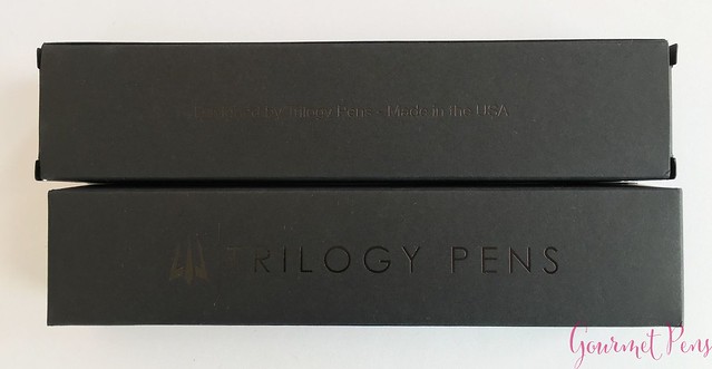
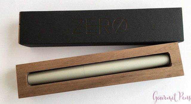
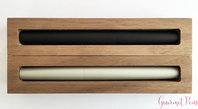
The minimalist concept of the Zero pen extends to its packaging. It begins with a slim black cardboard box. It has the Trilogy Pens logo, and 'Trilogy Pens' printed on one side in a glossy black. The other side has: 'Designed by Trilogy Pens/Made in the USA' printed on it. Inside the box, there is a black sleeve with ZERO printed on it, and this protects the actual wooden box inside. The pen sits in a cut-out in the box. The wood itself feels a bit rough (although I don't know much about wood working) but I think the simplicity of having a wooden box instead of a large clamshell-style gift box is nice. The wood could use some attention to the finishing, so it doesn't feel so sharp. When holding it, I was a bit worried about splinters. Maybe this will be addressed in the final products?
APPEARANCE
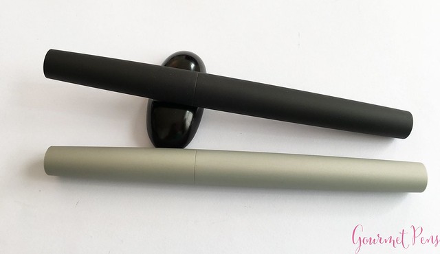
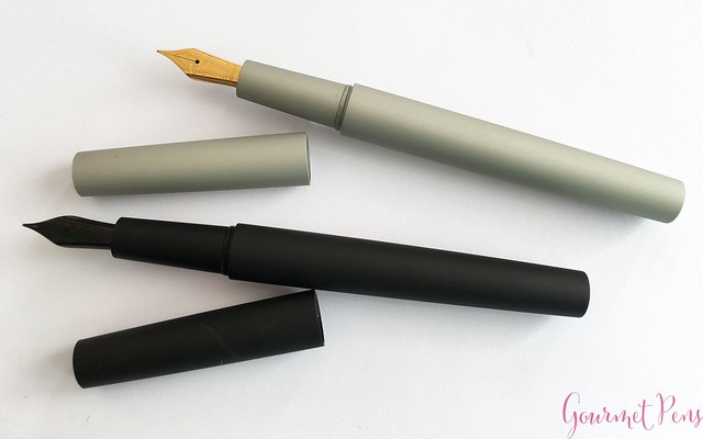
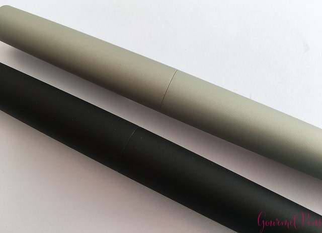
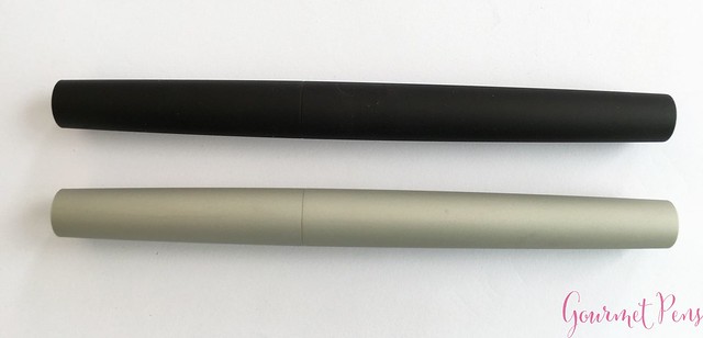
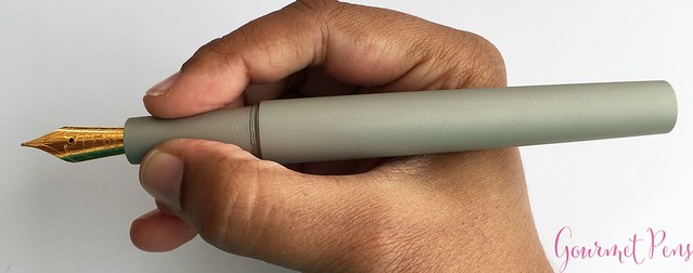
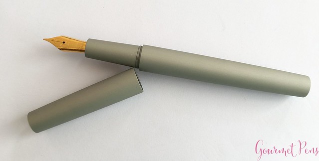
Trilogy Pens designed the Zero as a minimalist fountain pen; as a piece of design as well as a writing instrument. The pen is rounded, widest at the cap-barrel joint, and tapers towards the very blunt, flat ends. There are no engravings or markings on the pen. I have both the silver and black anodized pens - they have a matte silver/black finish that is low key and subtle.
My friend Mike at The Clicky Post mentioned the threads showing wear - it appears to happen on the silver pen as well, but because it's silver on silver, it doesn't look as obvious as with the black pen.
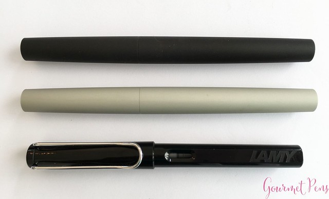
What really surprised me about these pens is the size. The cap is not tiny, and the barrel is pretty long. Definitely full sized pens.
NIB & PERFORMANCE
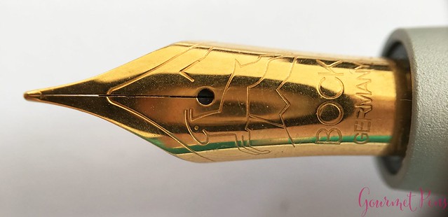
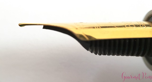
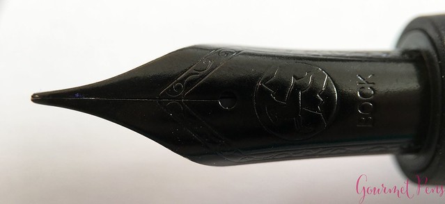
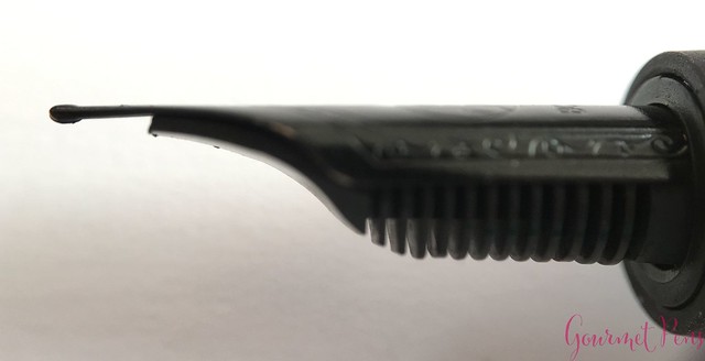
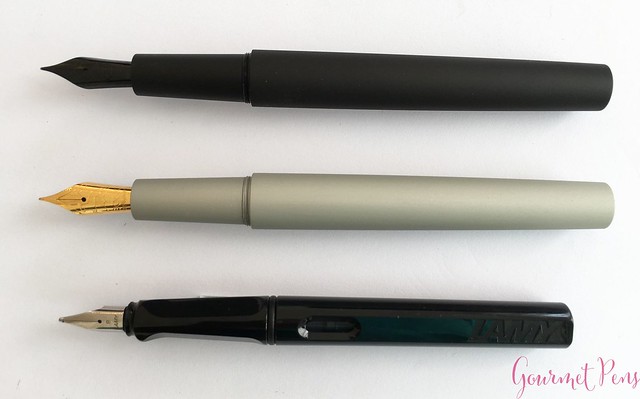
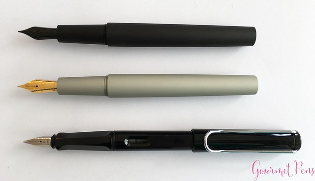
Both pens are fitted with a #6 Bock steel nib. One is gold colored, which looks quite yellow, and the other is black. They have a single slit, a round breather hole, and are engraved with lines that look like mountains, the Bock logo, and Bock Germany. There are no nib sizes indicated.
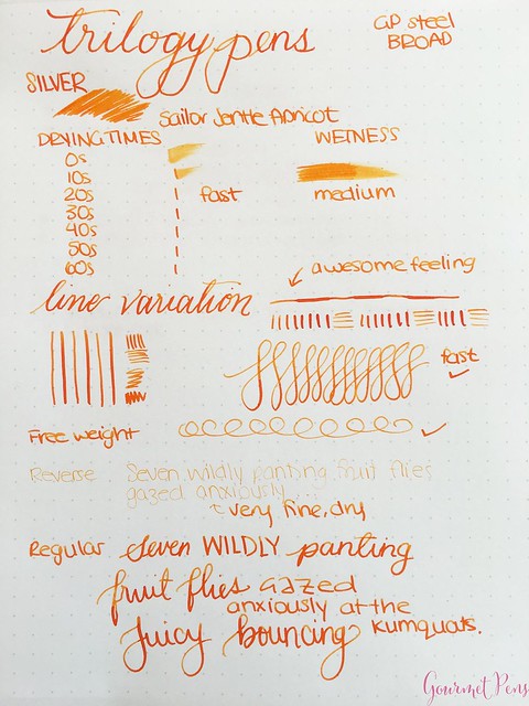
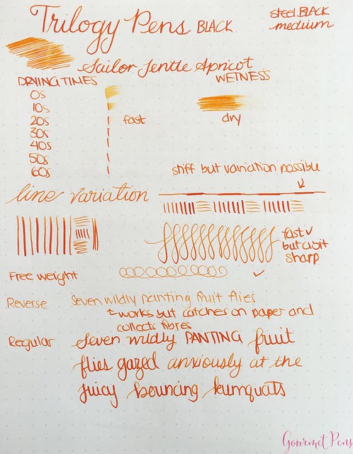
The broad nib on the silver pen is smooth and medium wet. It is mostly firm when writing, but it can produce a little bit of line variation if you add some pressure. Drying times are fast, and the nib is well adjusted and well tuned. It passes the free weight test and can even be used for reverse writing. The nib feels more like a medium to me, but either way, it is pretty reliable and consistent to perform as a daily nib.
I wasn't as thrilled about the black nib. It looks cool, but I found it wrote dry and had quite a bit of feedback. The tipping appears to be coated in the black color (PVD?) and as I wrote, it wore off, exposing the steel underneath. It started to feel like there was less feedback as I broke it in, but if you want a smoother nib, I would not select the black. It is also a firm nib, with a little bit of line variation. It wrote well otherwise - great if you need something that dries quickly and doesn't gush ink. It's not the kind of nib I favor, but I imagine this is the writing experience some seek - some feedback, fast drying, not too wet.
IN HAND
No clip, and Trilogy Pens says, "Perfect is achieved not when there is nothing left to add, but when there is nothing left to take away." I can't really argue with that. So, no clip. It can roll, but if you use the wooden box on your desk, you can use that as a pen rest!
The section is long, smooth, round, and it tapers towards the nib before ending in a ridge. A sharp ridge. It's not a slippery section and it's pretty comfortable to hold. If you grip low, that ridge at the end is sharp, but it's also a large enough section to avoid that. As stated, the threads are sharp and noisy, and there is a sharp step from the section to the barrel. The step up to the barrel didn't get in my way, as it was far back.
The pen is not designed to be posted. Unposted, it is a large, long pen in my hand. The anodized finish offers a bit of texture and feels good. The pen is not too heavy and it feels balanced. It's a touch long for me, but because it's not heavy, I can manage it comfortably enough. For my hands, I wouldn't select this as a daily user because it's not just right, but if you have larger hands, it is likely to be more suitable.
Overall, the edges are sharp - the end of the section, the section-barrel ridge, and the ends of the pen - all blunt, sharp edges. The threads should be fixed in the Kickstarter final products, but I cannot speak for the rest of them. I wouldn't say they're horrible, but just be aware of them.
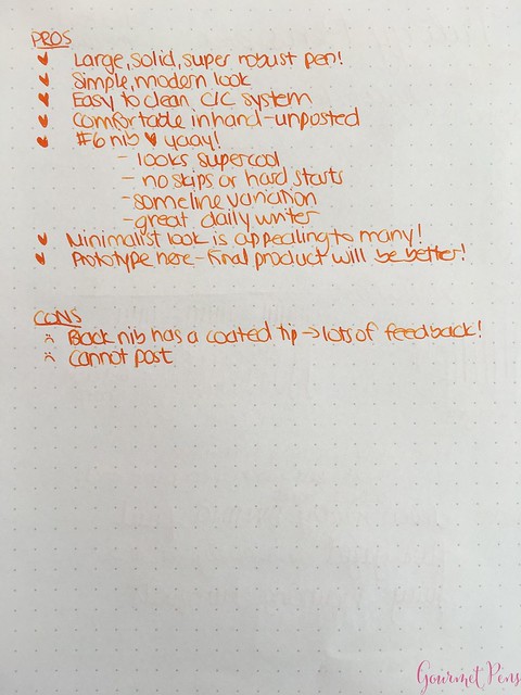
PROS & CONS
OVERALL
Kickstarter sees a lot of pens nowadays, many of which describe themselves as minimalist. The Zero has a nice look, a cool design, and it is indeed minimalist - there are no bells and whistles, and even the packaging is simple. I like the full package. I think the large size and simplicity of the pen and the final product is appealing, so long as the points mentioned by the makers are indeed fixed. The #6 steel nib is great for daily use, and the C/C system is easy to use. The price, IMHO, is fair.





0 comments:
Post a Comment