Wednesday, May 31, 2017
Tuesday, May 30, 2017
Review: Montblanc Meisterstück 149 PT Fountain Pen - Oblique Triple Broad @Montblanc_World @AppelboomLaren
Reviewing a pen I've had in my possession for a few years now. Appelboom lent it to me awhile back to review... and I couldn't send it back, so now it's mine forever!!! Muahahaha!
Trim: Platinum
Nib material: 18kt gold (two-tone)
Filling system: Piston
Ink window: Yes
Cap: Threaded
Posts: Yes, friction
Length (capped): 146.8 mm/5.78”
Length (uncapped): 131.7 mm/5.18”
Length (posted): 164.0 mm/6.46”
Diameter (barrel): 14.9 mm/0.58”
Diameter (section): 13.0 mm/0.51”
Weight (all): 32 g
Weight (cap): 12 g
Weight (body): 20 g
Price: $724.70 USD (without tax)
Where to buy: Appelboom
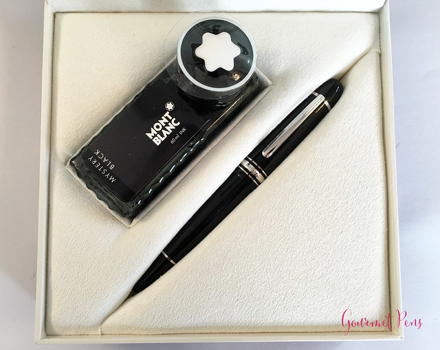
The box inside is a hard, black clam shell box with a pebbled texture to it. The snow cap logo is printed on the top in silver. The box opens up and the inside is an off-white, creamy velvet. The pen is nestled in a squishy felt bed, along with a bottle of Montblanc's Mystery Black ink. A foam sheet keeps everything secure and protected. Again, I like this simplicity - it's clean and presentation is nice, but it's not over the top and (too) excessive.
There is also a large service guide that accompanies the pen. It's worth reading through, especially if you are unfamiliar with Montblanc and/or fountain pens.
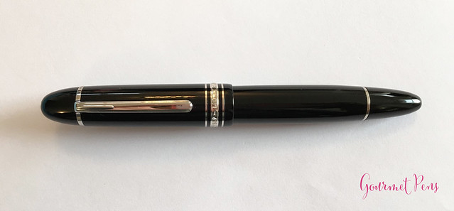
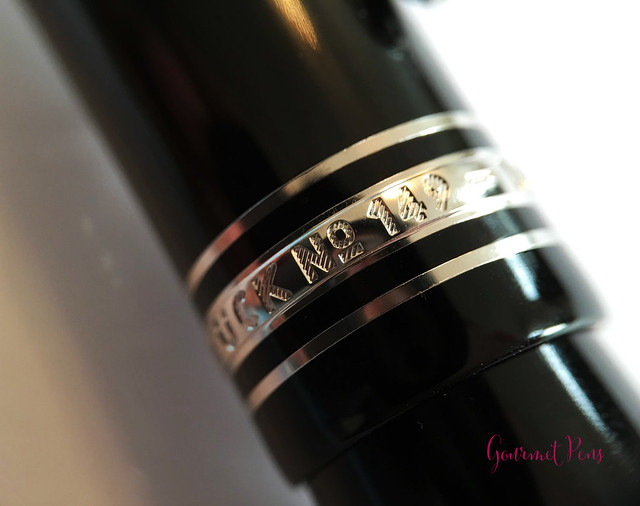
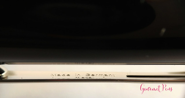
The center band near the end of the cap has two thinner bands set flush in the cap, and these flank a wider, raised band in the middle. The raised band is engraved with: Montblanc - Meisterstück No 149" and the raised letters have a little lined texture to them so they are easy to read. There is one more thin ring on the barrel that marks the piston-turning knob.
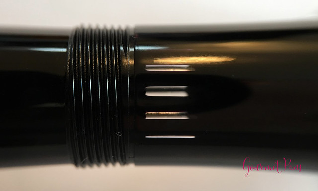
A small detail that's nice is, unlike the small ridge leading from the barrel to the piston-turning knob on the Pelikan Souverän, there is no ridge between the barrel and knob on the 149. It's smooth to look at and to the touch (if such a detail concerns you).
There is a striated, clear ink window in the barrel, which is only visible when the pen is uncapped. It's a large window, though, so there is enough space to see where your ink is at when it starts getting low.
The section is round and fairly wide, with no taper or indent in the shape. The end has a matte plastic lip. Other than that, the cap and barrel are all a smooth, highly polished black resin. In the light at an angle, you may be able to see a subtle, deep red glow in the resin. It looks like the core of the pen is glowing and the black is trying to blot it out. It's a rather pretty effect!
Again, this is a simple, classic cigar pen that I really like. The cigar shape is one of my favorites, so this works for me. The pen is well made and well put together - there are no rough, unfinished edge or loose bits. Which you would expect, of course.

Top to bottom: Meisterstück 149 GT, Meisterstück 149 PT, Meisterstück 146 PT, Meisterstück 146 90th Anniversary
Top to bottom: Meisterstück 149 GT, Meisterstück 149 PT, Meisterstück 146 PT, Meisterstück 146 90th Anniversary
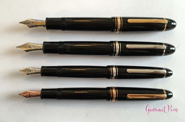
Top to bottom: Meisterstück 149 GT, Meisterstück 149 PT, Meisterstück 146 PT, Meisterstück 146 90th Anniversary
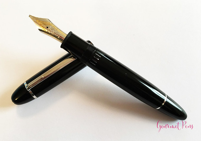
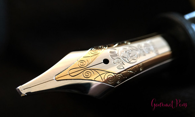
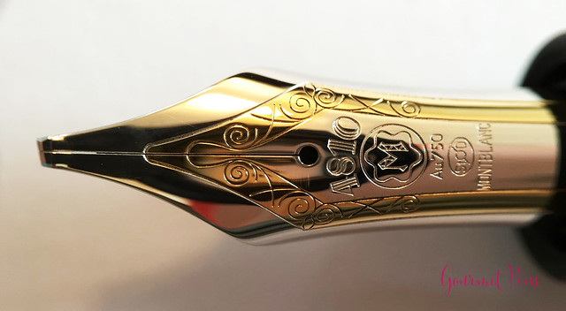
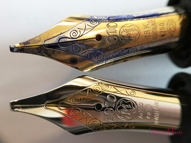
Unlike the regular gold trim version of this pen, the flourishes are in the yellow-gold section of the nib, and the rest of the nib is rhodium plated. The gold version is the opposite. I think it looks fantastic - the small amount of yellow gold gives the nib a slightly warmer look, but the rhodium majority matches the trim perfectly. The nib is coupled with a large plastic feed.
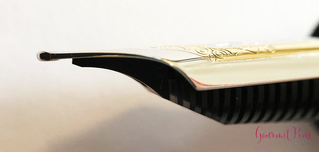
What's the difference between an oblique triple broad and a "regular" triple broad? The regular has a round tip, whereas the oblique is ground at (in this case) a left angle, and this nib also has a stub shape. The left oblique is cut for right-handed writers who write with their pens slightly rotated so the nib hits the page at an angle instead of straight like with a round nib. (For more oblique and other great nib info, check out Richard Binder's Nibs II page).
The triple broad tip size is so fun. I love broad nibs and I also love stubs, so this is a wonderful combination for me. The oblique cut is visible to the naked eye, and although I comfortably write with round points straight on the page, I can also accommodate the rotation for an oblique. I really enjoy using this nib for regular writing, and it's certainly a generous tip - some may find it far too wide for daily use. I think it's just right!
The clip is practical. It works well for pockets pages, and pouches. I would avoid lifting and snapping it against the cap - there's a fair amount of tension in it. It's snug enough that the pen is secure and won't slip off your paper.
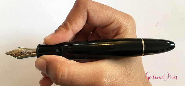
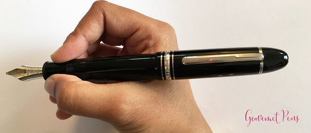
Unposted, the pen is thick in hand, but it isn't very heavy or long, and I find it well balanced. It looks a little naked unposted, but that's how I use it. The cap can be posted by friction, and it is secure. I love how it looks when posted, but I can only use it for a short while. The added weight makes the pen feel more substantial, and I can grip it just a little higher for the right balance. Given its size, you may not need it posted unless you like to post your pens.
So in summary: I basically bought this because of the nib. If it had any other nib on it, fine, medium, broad, I wouldn't have sprung for it. Oblique triple broad? That's a keeper!
ABOUT
Body material: Precious resinTrim: Platinum
Nib material: 18kt gold (two-tone)
Filling system: Piston
Ink window: Yes
Cap: Threaded
Posts: Yes, friction
Length (capped): 146.8 mm/5.78”
Length (uncapped): 131.7 mm/5.18”
Length (posted): 164.0 mm/6.46”
Diameter (barrel): 14.9 mm/0.58”
Diameter (section): 13.0 mm/0.51”
Weight (all): 32 g
Weight (cap): 12 g
Weight (body): 20 g
Price: $724.70 USD (without tax)
Where to buy: Appelboom
PACKAGING
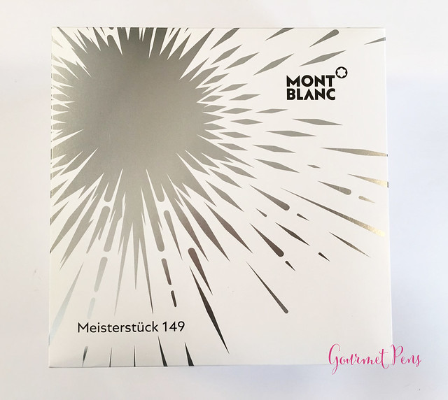
The 149 Platinum box is large but simple. I think the most ornate part of it is the outer cardboard box, which is white with a silver starburst. The top right corner has Montblanc and the logo printed on it, and the bottom left corner says "Meisterstück 149". Seeing this in a box from Appelboom made my heart go pitter patter, because I knew he would send something with a wicked nib.The box inside is a hard, black clam shell box with a pebbled texture to it. The snow cap logo is printed on the top in silver. The box opens up and the inside is an off-white, creamy velvet. The pen is nestled in a squishy felt bed, along with a bottle of Montblanc's Mystery Black ink. A foam sheet keeps everything secure and protected. Again, I like this simplicity - it's clean and presentation is nice, but it's not over the top and (too) excessive.
There is also a large service guide that accompanies the pen. It's worth reading through, especially if you are unfamiliar with Montblanc and/or fountain pens.
APPEARANCE
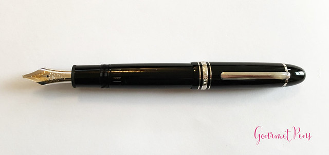
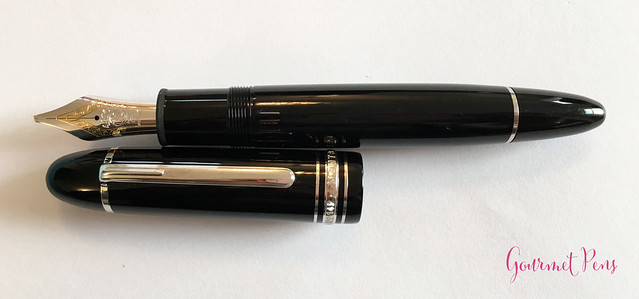
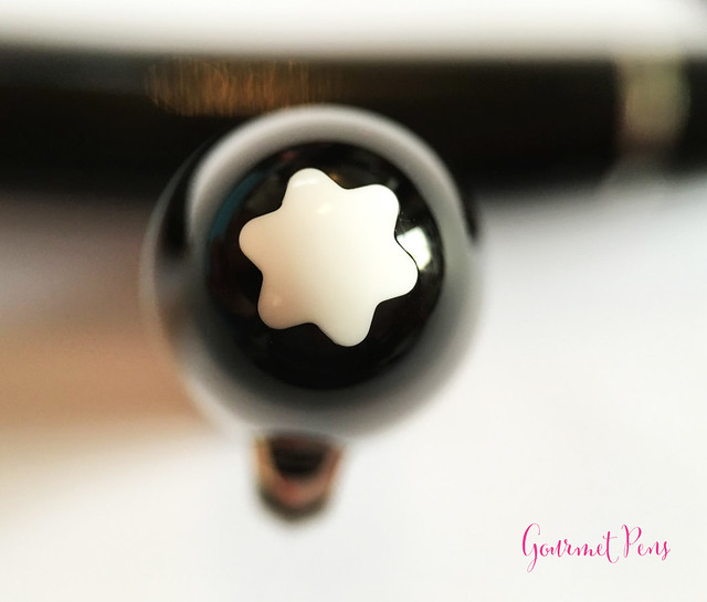
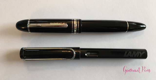
The Meisterstück 149 is a large, elegant, cigar-shaped pen that has a pretty classic look and design. Both the cap and barrel are round, and the barrel tapers slightly into a rounded off point - torpedo ends, basically. The cap does the same. The finial is a very white, solid snow cap, set flush in the black resin. The clip is attached externally by a thin band set flush in the cap. The band is engraved with the pen's serial number in a very tiny font. The clip is very classy and simple - it has a rounded end and a rocker ball underneath it, but there are no markings or engravings on it.The center band near the end of the cap has two thinner bands set flush in the cap, and these flank a wider, raised band in the middle. The raised band is engraved with: Montblanc - Meisterstück No 149" and the raised letters have a little lined texture to them so they are easy to read. There is one more thin ring on the barrel that marks the piston-turning knob.
A small detail that's nice is, unlike the small ridge leading from the barrel to the piston-turning knob on the Pelikan Souverän, there is no ridge between the barrel and knob on the 149. It's smooth to look at and to the touch (if such a detail concerns you).
There is a striated, clear ink window in the barrel, which is only visible when the pen is uncapped. It's a large window, though, so there is enough space to see where your ink is at when it starts getting low.
The section is round and fairly wide, with no taper or indent in the shape. The end has a matte plastic lip. Other than that, the cap and barrel are all a smooth, highly polished black resin. In the light at an angle, you may be able to see a subtle, deep red glow in the resin. It looks like the core of the pen is glowing and the black is trying to blot it out. It's a rather pretty effect!
Again, this is a simple, classic cigar pen that I really like. The cigar shape is one of my favorites, so this works for me. The pen is well made and well put together - there are no rough, unfinished edge or loose bits. Which you would expect, of course.

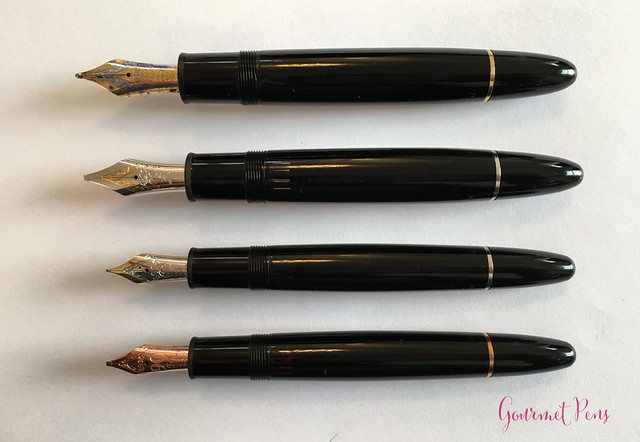
Top to bottom: Meisterstück 149 GT, Meisterstück 149 PT, Meisterstück 146 PT, Meisterstück 146 90th Anniversary

Top to bottom: Meisterstück 149 GT, Meisterstück 149 PT, Meisterstück 146 PT, Meisterstück 146 90th Anniversary

Top to bottom: Meisterstück 149 GT, Meisterstück 149 PT, Meisterstück 146 PT, Meisterstück 146 90th Anniversary
NIB & PERFORMANCE
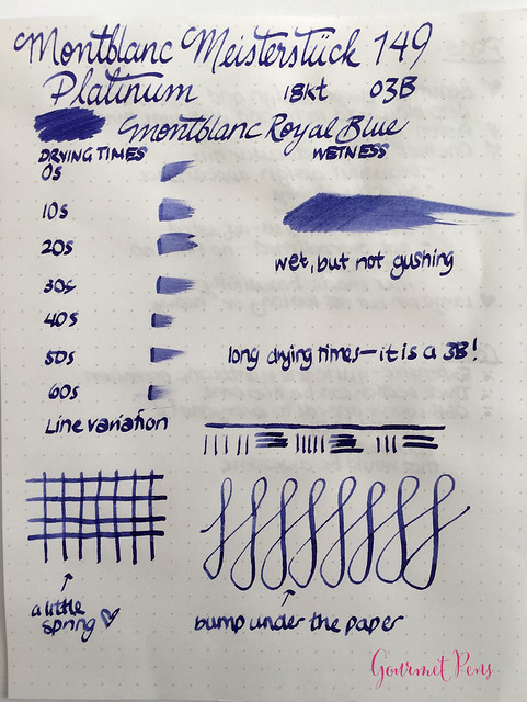
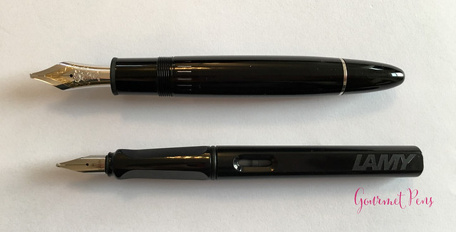
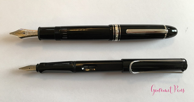
This large, delicious two-tone nib is the main reason I could not part with this pen. It is an 18kt gold oblique triple broad. The nib has a single slit, a round breather hole, and a stunning wide tip. It is engraved with 4810, the Montblanc 'M', the gold content, Montblanc, and some flourishes.Unlike the regular gold trim version of this pen, the flourishes are in the yellow-gold section of the nib, and the rest of the nib is rhodium plated. The gold version is the opposite. I think it looks fantastic - the small amount of yellow gold gives the nib a slightly warmer look, but the rhodium majority matches the trim perfectly. The nib is coupled with a large plastic feed.
Top: Meisterstück 149 Gold Trim
Bottom: Meisterstück 149 Platinum Trim
I did not flush this pen before inking it, because I forgot. Usually with a new pen, I flush it with dilute dish soap to make sure there's no machining oil left in the feed or on the nib. This isn't always required, but it doesn't really hurt either. Anyway, this time I didn't, and the pen performed beautifully. The nib is smooth and does not skip or hard start. It's a pretty firm nib as modern Montblanc nibs are but a little line variation is possible with some pressure. Ink flow is steady and consistent, and the line variation from the shape of the nib itself gives great character to one's writing. The downstroke is wide and the cross strokers are thinner. Ink flow is wet, and if the nib is aligned with the paper while you write, it will not skip.What's the difference between an oblique triple broad and a "regular" triple broad? The regular has a round tip, whereas the oblique is ground at (in this case) a left angle, and this nib also has a stub shape. The left oblique is cut for right-handed writers who write with their pens slightly rotated so the nib hits the page at an angle instead of straight like with a round nib. (For more oblique and other great nib info, check out Richard Binder's Nibs II page).
The triple broad tip size is so fun. I love broad nibs and I also love stubs, so this is a wonderful combination for me. The oblique cut is visible to the naked eye, and although I comfortably write with round points straight on the page, I can also accommodate the rotation for an oblique. I really enjoy using this nib for regular writing, and it's certainly a generous tip - some may find it far too wide for daily use. I think it's just right!
IN HAND
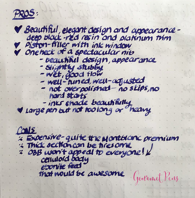
The section of the 149 is the one thing that makes this pen difficult for me to use. Many users think of the 149 as an oversize, but it's not necessarily very long, it's actually quite wide! The section is thick and beefy, as is the pen, but the section also has no indent or flare or anything, so it's just a wide area to grip and hold on to. I can use it for awhile, but it's not the most comfortable shape for me. If you grip right at the front end of the section, the edge may bite a little, especially if you grip tightly.The clip is practical. It works well for pockets pages, and pouches. I would avoid lifting and snapping it against the cap - there's a fair amount of tension in it. It's snug enough that the pen is secure and won't slip off your paper.
Unposted, the pen is thick in hand, but it isn't very heavy or long, and I find it well balanced. It looks a little naked unposted, but that's how I use it. The cap can be posted by friction, and it is secure. I love how it looks when posted, but I can only use it for a short while. The added weight makes the pen feel more substantial, and I can grip it just a little higher for the right balance. Given its size, you may not need it posted unless you like to post your pens.
PROS & CONS
OVERALL
People sometimes wonder if Montblanc is worth it, if it's overpriced, etc. Well, yes it is overpriced, but I think most pens (and things) are. It's a hard question to answer because the value of a pen varies from person to person. What also matters is your personal preference! What this pen does have is: 'status', recognizable, piston filler, ink window, attractive and elegant, great nib selection, not too hard to find. I don't really care for the status, I just really like the nib and that's worth it to me. It's not going to be worth it for everyone, and that's ok. The premium is high and the return will vary person to person. This is not my first Montblanc and it probably won't be my last, but I also have a pretty wide selection of pens!So in summary: I basically bought this because of the nib. If it had any other nib on it, fine, medium, broad, I wouldn't have sprung for it. Oblique triple broad? That's a keeper!
Sunday, May 28, 2017
Sunday Reads: May 28. 2017
Stuff I Looked At Elsewhere
- Inside the bizarre life of the star nosed mole - National Geographic.
- Seven ways to turn your tiny apartment into a meditative space - Hello Giggles.
- Peanut sauce - Epicurious.
- How to make perfect shortbread cookies - Food Republic.
- How to use a brush pen - Sketch Book Skool.
- Baked beet cheaps - Foodie Crush.
- The beginner's guide to fountain pens - JetPens blog.
- DIY Clear make up bag - A Beautiful Mess.
- Five tips for maintaining calligraphy nibs - The Postman's Knock.
- ICYMI: The Pelikan's Perch Limited Edition Spotlight!
- A beautiful spring timelapse - Twisted Sifter.
- Janine Scribbles has some delectable ink log pages.
- ICYMI: Stephen reviewed Eric's Danitrio Mikado fountain pen!
- Shutterbean's current favorite art supplies.
- This may or may not be entirely true, but they're comical: reasons why kids are crying on Sad and Useless.
Stuff I Apparently Did This Week
- Ink Shot Review: Franklin-Christoph Tenebris Purpuratum
- Wordless Wednesday
- Review: YStudio The Weight of Words Portable Fountain Pen
- Whiskers & Paws May 2017 Edition
If you're doing any browsing and shopping, please do check out my sponsors in the side bar, because they help make all this possible. Some of these links are affiliate links, which provides me with a small commission but does not add any extra cost to your purchase. Some links are just referral links, but there is no obligation to purchase through any of these links. Your purchases through my links help support this blog and allows me to fulfill review requests. Either way, I appreciate your readership and your support so much, so thank you!
Thank you to everyone who supports my weirdness.
Thank you to everyone who supports my weirdness.
Friday, May 26, 2017
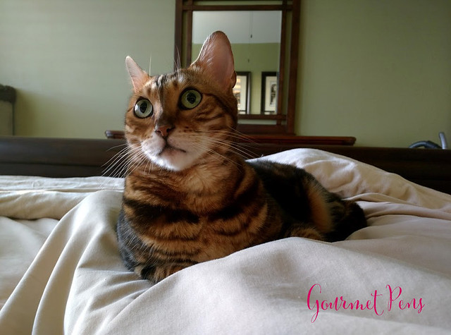
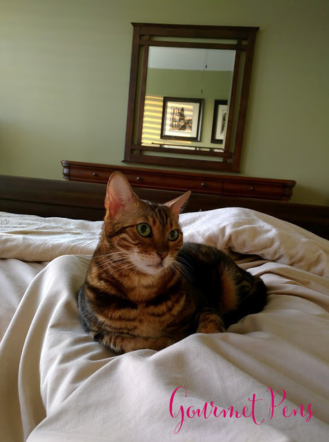
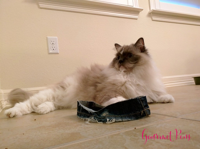
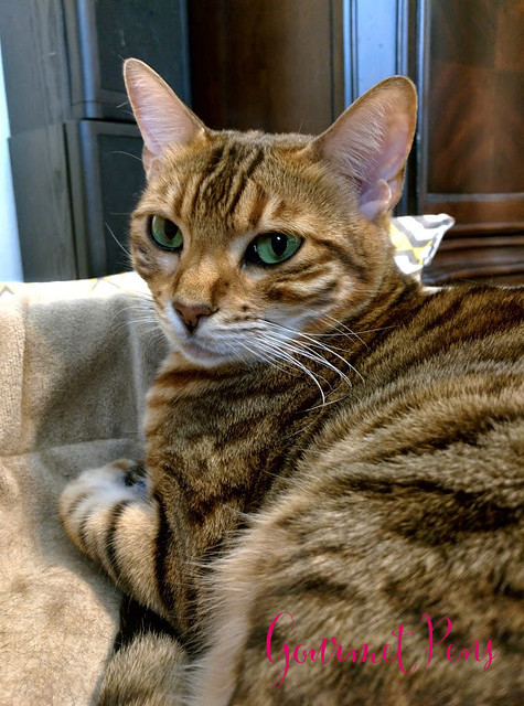
Whiskers & Paws: May 2017 Edition
Labels:
Bengals,
Cats,
Feline Friday,
Koa,
Peaches,
Ragdoll,
Tyco,
Whiskers and Paws
Thursday, May 25, 2017
Review: YStudio The Weight of Words Portable Fountain Pen @AppelboomLaren
Appelboom sent these two very interesting fountain pens for review, and they are a very pretty package! This is not the style of pen I would otherwise pick up for myself. They look interesting and they look clean, but I usually like resin/celluloid pens for how they feel. Usually. Not always. So I gave these pens a good go to see how I felt about them.
Body material of Brassing: Brass
Trim: None
Cord material: Leather
Pen Case: Maple wood
Nib material: #5 Schimdt steel
Filling material: Standard international cartridge/converter
Cap: Snap on
Posts: No
CLASSIC COPPER
Length (capped): 138.2 mm/5.44"
Length (uncapped): 119.2 mm/4.69"
Length (posted): N/A
Length (section): 23.7 mm/0.42"
Diameter (barrel): 10.2 mm/0.40"
Diameter (section): 7.6 - 9.2 mm/0.30" - 0.36"
Length (case): 138.0 mm/5.43"
Width (case): 21.2 mm/0.83"
Weight (all): 50 g
Weight (cap): 20 g
Weight (body): 30 g
BRASSING (black)
Same length/diameter as Classic
Weight (all): 46 g
Weight (cap): 16 g
Weight (body): 30 g
Price: $126.03 USD
Where to buy: Appelboom - Brassing | Classic
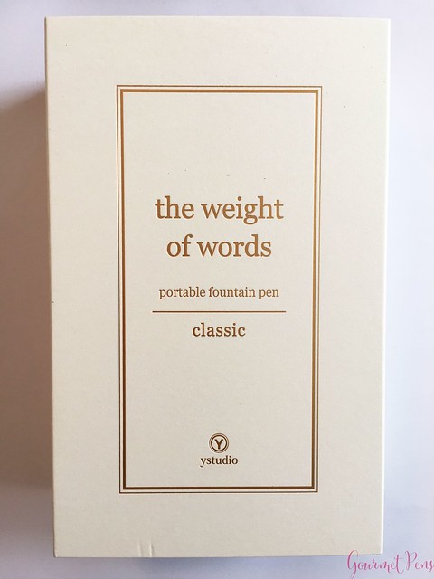
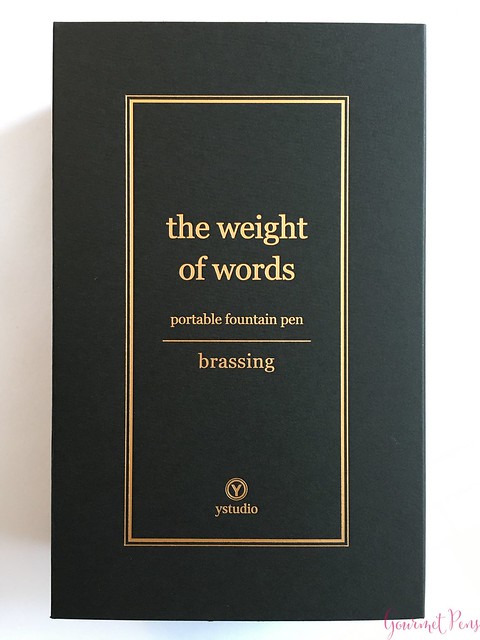
The boxes are quite large compared to the size of the pen. The first layer is a thick paper sleeve in either black with gold writing, or white with copper writing. The sleeve has a boxed border around the print: the weight of words, portable fountain pen, classic/brassing, and the YStudio logo at the bottom.
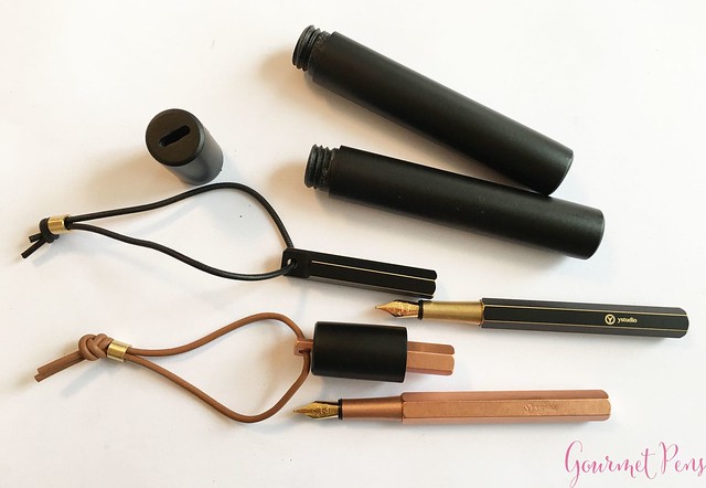
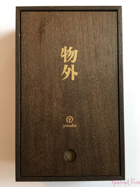
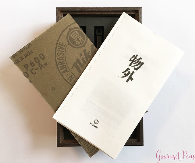
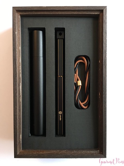
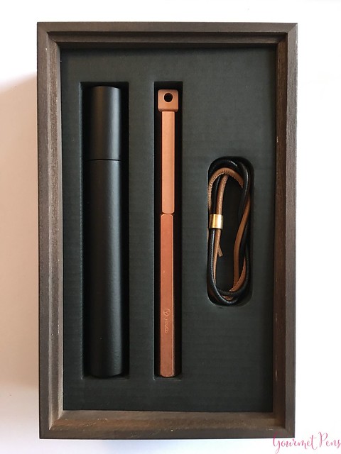
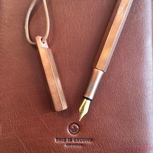
The box is a solid, dark wood with gorgeous striations and gold characters on the top. There is a small hole in the lid of the box which makes removing the slim lid easy. There is a rice paper pen guide inside, which is also quite elegant. The rice paper is doubled up so it is a little thicker and fairly tough, and it has a stitched binding. It gives information about YStudio, the Brassing series, nature of materials. how to use the contents, etc. Along with this, there are two leather cords (brown, black), two brass beads (one for each pen), and a maple wood case to house the pen. The Brassing pen comes with a sheet of sandpaper for removing the black paint should you wish. Whereas the copper will patina, the Brassing won't change much unless you do some work on it.
The presentation makes me think of the Japanese pens - limited edition sailors and Pelikans, and Nakayas - which are presented in lightweight wooden boxes. They are not particularly ornate but they are very classy. These pens are made in Taiwan with great care, and I think the attention to detail is obvious in both presentation and the finishing of the pen.
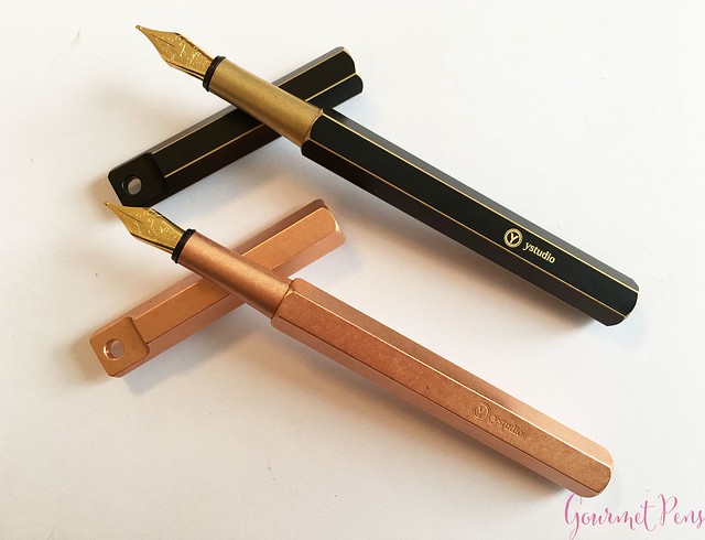
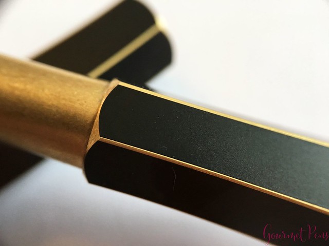
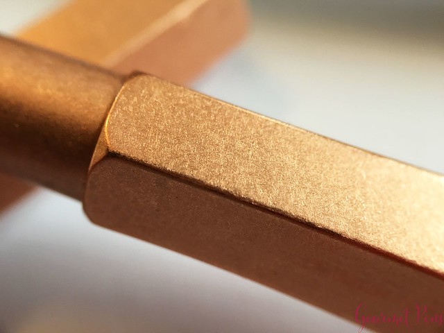
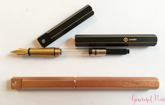
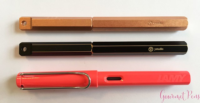
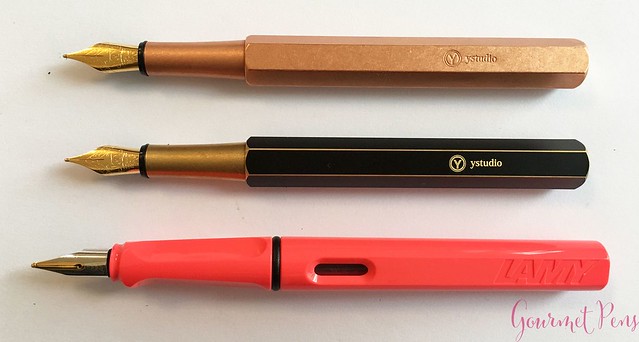
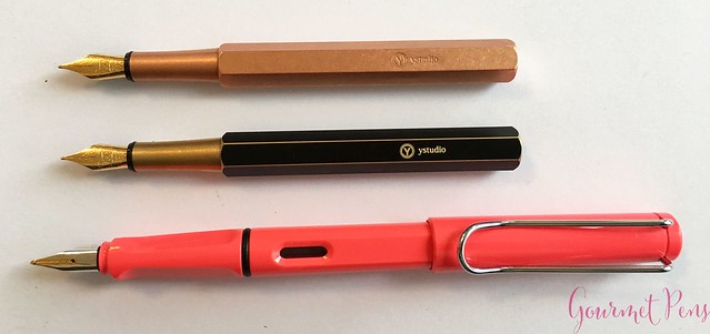
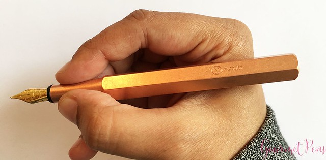
The cap and barrel snaps together with all the facets aligned, and if it doesn't, you can just rotate the cap until they match. The barrel is engraved with the logo and "YStudio". The Classic Copper pen is all copper and the Brassing is matte black with brass edges peeking out. The Classic has a copper section, whereas the Brassing has, not surprisingly, a brass section. It's a slender section that tapers slightly towards the nib. The copper is bright and shiny when it is new, and the Brassing has a matte black finish.
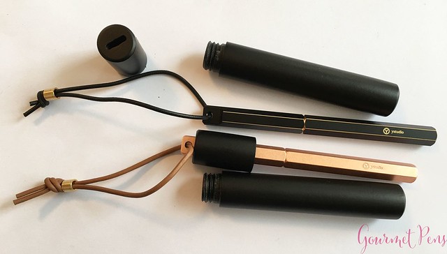
The case is round and smooth, made of black wood with a screw on cap and a hole in the top for the pen cap to sit in. That's it. Simple case. The pens are also quite simple, but I like the compact, clean design. They look well made and unique, and they certainly are a different look to my pen case!
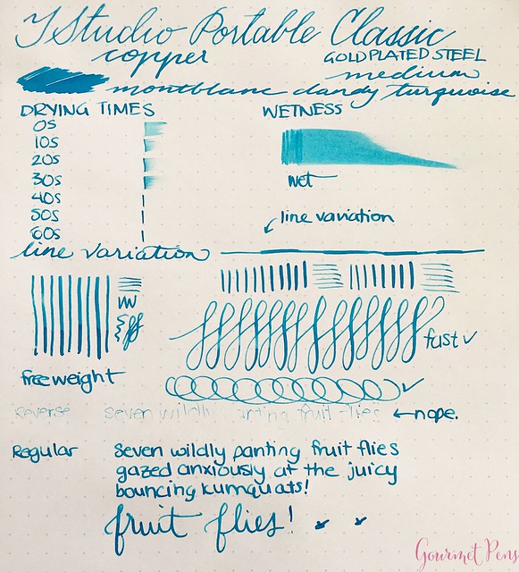
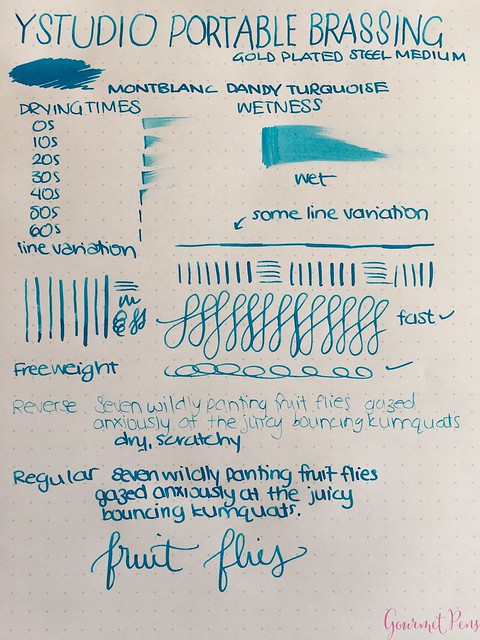
Both are medium nibs and overall, they work well. Drying times are average, around 30 seconds with fairly wet ink flow. The nibs are on the firm side, they did not skip or hard start during normal writing. With a bit of pressure, a little line variation is possible. On smooth paper, I could feel a little slipping from the nibs being slightly dry - but once they were going, ink flow was consistent. Not the most amazing or unique writing experience ever - I think both nibs could use a quick tuning (made slightly wetter) but they work pretty well. I did not find them skippy mid letter, which is good. A hard starting nib is pretty easy to tune up, and it doesn't really need it, but to make them ideal, that's all it would take.
The converters were included and worked well. Makes inking and cleaning quick and easy. They're also pretty affordable to replace should you break or lose it.
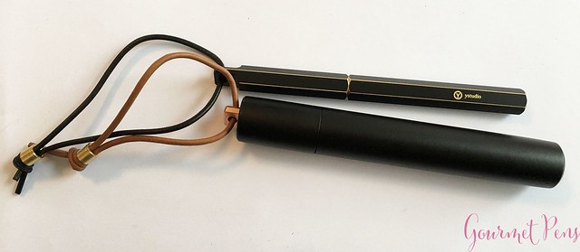
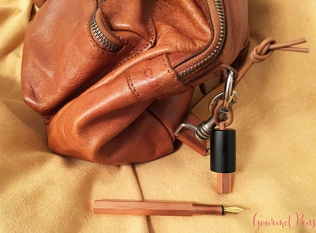
You don't have to use the wooden case, of course. The pens are metal and they are pretty tough - they can easily handle being bumped and tumbled around, so they don't need to be protected by the case. I like the idea of tying my pen to my bag and always having one at the ready. I did not have any ink burps into the cap because the pen was often facing upwards. On the other hand, this meant the pen occasionally dried up a little and I had to lick the nib to get it writing quickly. (OK... I didn't HAVE to lick the nib, but I did because it's the fastest way to get it going). The pen did not randomly uncap itself and there were no inky messes. The downside is if you want to quickly remove the whole pen, you can't - you have to untie it first!
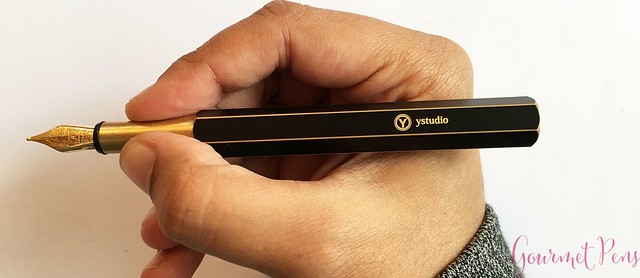
The sections are slender, smooth, and feel nice because there are no threads. Even though they are slender, I found the shape comfortable and the material was not slippery. Given the width of the sections, there will probably be some out there who will find it way too thin for use.
Unposted, the pens are compact but feel comfortable in hand. Well balanced, no effort to write with. I love how the metal warms up on the Classic Copper more than the Brassing, which is smoother. They are not so big and heavy that the metal bodies feel unwieldy. The caps cannot be posted, so you have to be able to use it unposted.
These are metal pens and that penny smell is definitely there. I did not find it overwhelming and although the smell rubbed off on my hands while writing, it wasn't too strong. That's a good thing, for those of you who like metal pens but hate the penny smell.
The Brassing pen comes with a sheet of sandpaper in the box that you can use to remove the black paint from the surface. I like the black pen as it is so I have not experimented with taking off the black paint (it also seems like a messy affair). The copper pen has developed some patina after months of use, but it took some time to get to the stage it's at now. I've seen other copper pens that have developed a patina much faster. The copper section changed more than the brass did.
I received these items free of charge for the purposes of this review. I was not compensated monetarily for my review. Everything you've read here is my own opinion.
ABOUT
Body material of Classic Copper: CopperBody material of Brassing: Brass
Trim: None
Cord material: Leather
Pen Case: Maple wood
Nib material: #5 Schimdt steel
Filling material: Standard international cartridge/converter
Cap: Snap on
Posts: No
CLASSIC COPPER
Length (capped): 138.2 mm/5.44"
Length (uncapped): 119.2 mm/4.69"
Length (posted): N/A
Length (section): 23.7 mm/0.42"
Diameter (barrel): 10.2 mm/0.40"
Diameter (section): 7.6 - 9.2 mm/0.30" - 0.36"
Length (case): 138.0 mm/5.43"
Width (case): 21.2 mm/0.83"
Weight (all): 50 g
Weight (cap): 20 g
Weight (body): 30 g
BRASSING (black)
Same length/diameter as Classic
Weight (all): 46 g
Weight (cap): 16 g
Weight (body): 30 g
Price: $126.03 USD
Where to buy: Appelboom - Brassing | Classic
Discount code: 10% off with 'friend'
PACKAGING
The YStudio fountain pens are beautifully presented! I was not expecting such elegant packaging from solid metal pens - I was expecting something more "daily carry" style and less "super pretty". Silly assumption, of course, because the YStudio packaging is daily carry AND super pretty! Nice clean corners, finished, and put together in a great package.The boxes are quite large compared to the size of the pen. The first layer is a thick paper sleeve in either black with gold writing, or white with copper writing. The sleeve has a boxed border around the print: the weight of words, portable fountain pen, classic/brassing, and the YStudio logo at the bottom.
The box is a solid, dark wood with gorgeous striations and gold characters on the top. There is a small hole in the lid of the box which makes removing the slim lid easy. There is a rice paper pen guide inside, which is also quite elegant. The rice paper is doubled up so it is a little thicker and fairly tough, and it has a stitched binding. It gives information about YStudio, the Brassing series, nature of materials. how to use the contents, etc. Along with this, there are two leather cords (brown, black), two brass beads (one for each pen), and a maple wood case to house the pen. The Brassing pen comes with a sheet of sandpaper for removing the black paint should you wish. Whereas the copper will patina, the Brassing won't change much unless you do some work on it.
The presentation makes me think of the Japanese pens - limited edition sailors and Pelikans, and Nakayas - which are presented in lightweight wooden boxes. They are not particularly ornate but they are very classy. These pens are made in Taiwan with great care, and I think the attention to detail is obvious in both presentation and the finishing of the pen.
APPEARACE
The YStudio Portable fountain pens are on the smaller side compared to most of the other pens I usually use. Both pens are hexagonal with distinct edges and flat, blunt ends. The top of the caps have holes for the leather strings, and for using the carry cases (or both). If you don't use the leather thongs, I think they look pretty cute as is.The cap and barrel snaps together with all the facets aligned, and if it doesn't, you can just rotate the cap until they match. The barrel is engraved with the logo and "YStudio". The Classic Copper pen is all copper and the Brassing is matte black with brass edges peeking out. The Classic has a copper section, whereas the Brassing has, not surprisingly, a brass section. It's a slender section that tapers slightly towards the nib. The copper is bright and shiny when it is new, and the Brassing has a matte black finish.
The case is round and smooth, made of black wood with a screw on cap and a hole in the top for the pen cap to sit in. That's it. Simple case. The pens are also quite simple, but I like the compact, clean design. They look well made and unique, and they certainly are a different look to my pen case!
NIB & PERFORMANCE
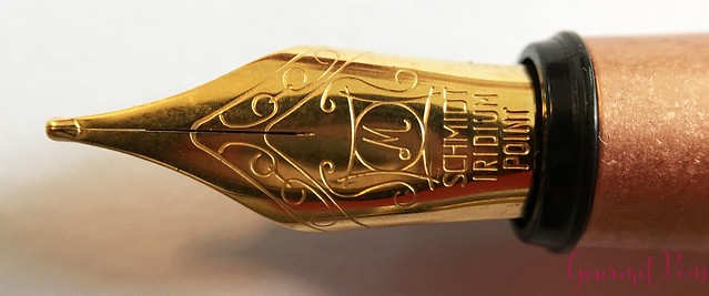
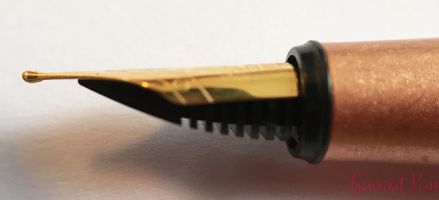
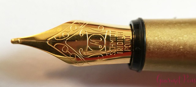
Both pens have a gold-plated medium steel nib. The #5 nibs are made by Schmidt - they have a single slit, no breather hole, and they are engraved with "Schmidt Iridium Point" with some flourishes.Both are medium nibs and overall, they work well. Drying times are average, around 30 seconds with fairly wet ink flow. The nibs are on the firm side, they did not skip or hard start during normal writing. With a bit of pressure, a little line variation is possible. On smooth paper, I could feel a little slipping from the nibs being slightly dry - but once they were going, ink flow was consistent. Not the most amazing or unique writing experience ever - I think both nibs could use a quick tuning (made slightly wetter) but they work pretty well. I did not find them skippy mid letter, which is good. A hard starting nib is pretty easy to tune up, and it doesn't really need it, but to make them ideal, that's all it would take.
The converters were included and worked well. Makes inking and cleaning quick and easy. They're also pretty affordable to replace should you break or lose it.
IN HAND
No clips here, but the whole idea of the portable system is you can either use the wooden case to carry your pen/attach your pen to things, or just attach the leather string to the hole directly, without the case. I tried using the case to tote the pens - all you do is put the pen cap through the slot in the case, tie your leather thong to whatever you want to hang your pen from, and tie it up. Then you can either carry the pen in the case with the barrel, or without the case barrel - then you just uncap the pen and you have your pen in hand!You don't have to use the wooden case, of course. The pens are metal and they are pretty tough - they can easily handle being bumped and tumbled around, so they don't need to be protected by the case. I like the idea of tying my pen to my bag and always having one at the ready. I did not have any ink burps into the cap because the pen was often facing upwards. On the other hand, this meant the pen occasionally dried up a little and I had to lick the nib to get it writing quickly. (OK... I didn't HAVE to lick the nib, but I did because it's the fastest way to get it going). The pen did not randomly uncap itself and there were no inky messes. The downside is if you want to quickly remove the whole pen, you can't - you have to untie it first!
The sections are slender, smooth, and feel nice because there are no threads. Even though they are slender, I found the shape comfortable and the material was not slippery. Given the width of the sections, there will probably be some out there who will find it way too thin for use.
Unposted, the pens are compact but feel comfortable in hand. Well balanced, no effort to write with. I love how the metal warms up on the Classic Copper more than the Brassing, which is smoother. They are not so big and heavy that the metal bodies feel unwieldy. The caps cannot be posted, so you have to be able to use it unposted.
These are metal pens and that penny smell is definitely there. I did not find it overwhelming and although the smell rubbed off on my hands while writing, it wasn't too strong. That's a good thing, for those of you who like metal pens but hate the penny smell.
The Brassing pen comes with a sheet of sandpaper in the box that you can use to remove the black paint from the surface. I like the black pen as it is so I have not experimented with taking off the black paint (it also seems like a messy affair). The copper pen has developed some patina after months of use, but it took some time to get to the stage it's at now. I've seen other copper pens that have developed a patina much faster. The copper section changed more than the brass did.
PROS & CONS
Classic Copper
OVERALL
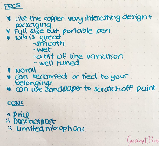
These are interesting pens! They are well presented, and the packaging includes everything you need - instructions, leather cords, carry case, converter - so you get the box and you're ready to go with some ink and paper. They are quite versatile in how you can carry and use them, they write well, they are definitely durable, and I think they are interesting to look at. The biggest downside is the price - I'm not saying $126 USD is too much, but the Euro amount at 130,00 is painful! However, if you like metal pens, these are a great choice - compact, tidy, pretty.I received these items free of charge for the purposes of this review. I was not compensated monetarily for my review. Everything you've read here is my own opinion.
Labels:
Appelboom,
Cartridge,
Converter,
edc,
fountain pen,
fountain pens,
office supplies,
Reviews,
stationery,
Steel Nib,
YStudio
Subscribe to:
Posts (Atom)

