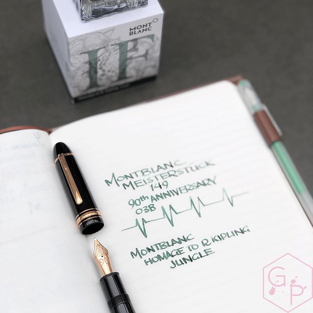
When I first posted about this ink back in July of 2019 (um a lifetime ago and my anxious mind did not even consider a pandemic would be coming up), my first question was, do you want a swab or a writing sample? Personally, I pick inks based on swabs even though it's completely illogical for most because it never looks the same in writing. Since I tend to use folded nibs and BBBBBB nibs anyway, swabs are actually not too far off for my personal use. Alas, the people spoke! Most of you voted for a writing sample - that thing about swabs not being indicative of actual use.
The doesn't have many hues but it does shade fairly well. It's a light, clean, sage-jungle green. I don't picture a tropical jungle so much as an urban jungle - a flatter, less vibrant color than an intense green tropical green. It's a good looking color that is unique to my ink stash. It seems like a green that is for those who don't care for greens all that much. I did not find it that different from the writing sample - it is not a particularly complex ink. No sheen, but quite some shading. I like it and I think it’s quite lovely. Well-behaved, easy to clean. I didn't find it particularly wet - ink flow was consistent and reliable. Would I bother using this in a fine nib? Absolutely not. It's a broad nib, at minimum. Or a flex nib. It would just bore me if it was in a fine nib. I don't have a picture to show you because I discovered this by accident when I spilled water on my journal but it looks great as a color wash. It has strange grey tones to it that I really like.
Three Montblanc ink swabs: Emerald Green, Irish Green, Kipling Jungle Green. Quite the range of greens!
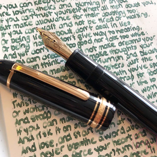
Sometimes I even use it with a normal nib size, such as this vintage Esterbrook flex nib (on a modern Esterbrook Estie). It's really legible and is easy on the eyes. I'd consider this pretty work appropriate.
Just for fun, let's throw the pen and notebook in for a glance. I usually don’t care for the modern Montblancs all that much, except for last year with the Homer and this one. Why? The horse from last year and the wolf on this one. I’m a sucker that way. Also, things named after food. I mean, look at these wolves!
If you want to see my review of the fountain pen and check out the notebook and ink, you can see the video here!
Tuesday, June 30, 2020
Montblanc Writer's Edition Homage to R. Kipling Jungle Green Ink
Labels:
Appelboom,
fountain pen ink,
ink,
inks,
Montblanc,
Special Edition
Friday, June 26, 2020
Handwriting with Leonardo Furore Gold Nib Fountain Pen
Oddly satisfying, quite lovely and fun!
See more Leonardo pens if you are curious about them - I have a full unboxing of this particular pen with the gold stub nib you see in action.
Leonardo Furore Emerald Turquoise Fountain Pen + 14KT Stub Nib (full video review)
If you are curious about the two most popular Leonardo pens models in this size - the MomentoZero and the Furore - check out the comparison below. I also compare the gold and steel nib options, which might help with your decision making!
Leonardo Officina Italiana Furore vs. MomentoZero Fountain Pens with Gold & Steel Nibs
Tuesday, June 23, 2020
Handwriting and Lettering with the Platinum #3776 Celluloid Karakusa Blue Coarse Nib
A friend loaned me this pen a little while ago and I have already unboxed it, in case you missed it, and if you have missed it I urge you to watch the video because it's truly beautiful and comfortable and I love writing with it. I made a short little video of some handwriting and lettering with it.
The coarse nib is super juicy and smooth but this one is perfectly polished and tuned so it doesn't have any sign of overpolishing/baby's bottom. No skipping, no hard starts. Combined with Platinum's Slip & Seal cap mechanism that prevents the nib from drying out, it's pretty perfect. I love the super round nib shape for lettering, though many people might not find it useful for daily writing. I use it for daily writing, though!
I hope you enjoy the video!
Music: BenSound https://www.bensound.com/royalty-free-music/cinematic
Labels:
18K Gold Nib,
18K Nib,
hand lettering,
handwriting,
Lettering,
oddly satisfying,
Platinum,
Video
Friday, June 19, 2020
ASC Ogiva Extra Wild Celluloid Fountain Pen MagicFlex Nib
Thank you to The Pen Family for loaning me this ASC Ogiva Extra Wild Celluloid Fountain Pen with the MagicFlex Nib so I could share it with you. It was an interesting experience - lovely pen, quite gorgeous and substantial but the nib was a little bit troublesome for me from time to time. Oddly enough, a few friends tried it out and they had no issues with the writing at all so it must be my weird writing angle!
Labels:
18K Gold Nib,
18K Nib,
ASC,
ASC Pens,
Compressor,
flex,
Flex Nib,
fountain pen,
fountain pens,
Modern Flex Nib,
The Pen Family,
Video
Tuesday, June 16, 2020
Sailor Durian Musang King Fountain Pen Inked With Louis Vuitton Ink!
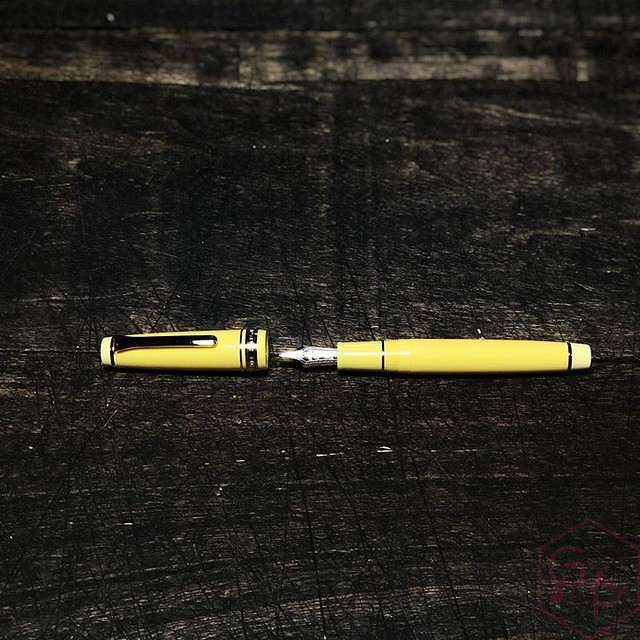
What's delicious but smelly? Tempting but repulsive? … This sounds pretty weird. When Pen Gallery released their Sailor Limited Edition Professional Gear Durian Musang King, I was like OMGAAAAAAWD and I ordered it immediately because I am in love with Pro Gears and I love durian and I love yellow. AND. It was available with zoom nibs so there was just no other possible option but to buy it. So I did.What the heck is a durian, you ask? A fruit that is banned in some places like hotels and on Singapore's public transport because of its pungency? Ah, enter Wikipedia for the most elegant of descriptions.
The durian is the fruit of several tree species belonging to the genus Durio. Named in some regions as the "king of fruits", the durian is distinctive for its large size, strong odour, and thorn-covered rind. The fruit can grow as large as 30 centimetres (12 inches) long and 15 cm (6 in) in diameter, and it typically weighs 1 to 3 kilograms (2 to 7 pounds). Its shape ranges from oblong to round, the colour of its husk green to brown, and its flesh pale yellow to red, depending on the species.
Some people regard the durian as having a pleasantly sweet fragrance, whereas others find the aroma overpowering with an unpleasant odour. The smell evokes reactions from deep appreciation to intense disgust, and has been described variously as rotten onions, turpentine, and raw sewage. The persistence of its odour, which may linger for several days, has led to the fruit's banishment from certain hotels and public transportation in Southeast Asia. By contrast, the nineteenth-century British naturalist Alfred Russel Wallace described its flesh as "a rich custard highly flavoured with almonds". The flesh can be consumed at various stages of ripeness, and it is used to flavour a wide variety of savoury and sweet desserts in Southeast Asian cuisines. The seeds can also be eaten when cooked.It's a strange looking fruit that I think is quite intriguing. Words that have been used to describe the smell range from gym sock to onions to excrement. Wow. Whatever you think of the smell, one thing is for sure: it can be smelled from some distance because it is potent. Oddly enough, it really does taste really good. I swear.
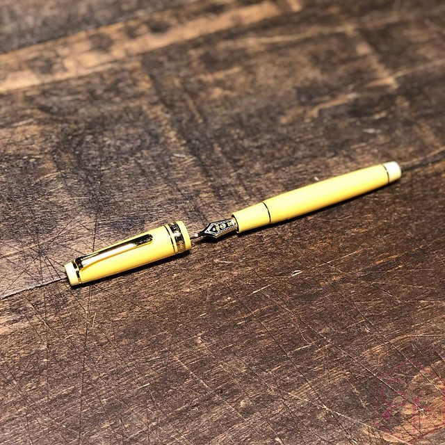
The packaging design is also really fun. I love the outer sleeve and they selected the nicer Sailor box - still simple but much better looking than the horrible blue clamshell box that I hate.
Probably one of the most adorable things about this pen, aside from the perfect creamy yellow, is the ABSOLUTELY ADORABLE WEE DURIAN on the end of the barrel. You can hate the durian in your mouth but it is just wicked cute like this.
A Haiku.
Sailor durian
Pen Gallery yellow pen
Zoom nib makes me weak
Are you for Haiku? Would you like to share one in the comments? I want to serenade my neurons with your sweet, smelly durian words. Several months later, it remains one of my favorite Sailors. The Pro Gear is one of my favorite models of fountain pen and is definitely my preferred Sailor model. It's just the right size, does not need posting, is light and comfortable and maintenance is very low. I really appreciate the very easy-to-use cartridge/converter and although the converter holds little ink, it's so easy to flush clean.
I have been using mostly yellow inks in it, and I know many of you hate yellow and when I use yellow in writing samples so I used an antique golden ink. It's the very special Louis Vuitton Or Audaxieux; a perfect, elegant color that shades so well. Another discontinued ink that I hate to love. I only have about 10 ml of it. It's most precious but I refuse to not use it. How could I possibly enjoy it if I never use it? What's the point of having any if I never get to enjoy it?
If you missed the video of it, here it is!
Labels:
21k Gold Nib,
Cartridge,
Converter,
fountain pen,
fountain pen ink,
fountain pens,
ink,
inks,
Louis Vuitton,
Pen Gallery,
Sailor
Friday, June 12, 2020
Hardy Pen Wrights Pink Scale Juma Custom Fountain Pen
Hello friends! I'm pretty excited about this pen so I hope you enjoy the video and seeing it close up. Visit Hardy Pens online!
The most biased part of this is the pink ink. It's my collaboration ink with PW Akkerman in The Hague (the only Akkerman that makes and sells these inks). It comes in the awesome fluted bottle with the nifty marble and it's sexy and I picked the pink. Here it is:
Akkerman
Vanness Pens
Lemur Ink
Bookbinders Design
Laywine's (call or email)
Labels:
#6 nib,
Cartridge,
Converter,
Custom,
fountain pen,
fountain pens,
Hardy Penwrights,
office supplies,
Reviews,
steel,
Steel Nib,
Video
Tuesday, June 9, 2020
Caran d'Ache SUPRACOLOR® Soft Aquarelle Paul Smith Watercolor Pencils
A few weeks ago, I was doing a pick up at Take Note Store and in the adorable little windows at the front of the store, these pencils were set out for pictures. I peered at them with curiosity and quarantine-related restlessness so they came home with me. Although I have fantasized about watercolor pencils, I have zero art skills. I cannot draw. I cannot art. Well I cannot art in a way that is appealing to the eye, how's that?
I have quite a few Caran d'Ache 849 ballpoints and I think one water brush but that's it. These are an entirely new venture for me. How bad could I possibly be, right? I mean, I have never used such pencils before, I have never "swatched" watercolors, I have zero clue what I'm doing. It can't be that bad. Even if it is that bad, what's the worst that can happen? Nothing. I embarrass myself. Whatever.
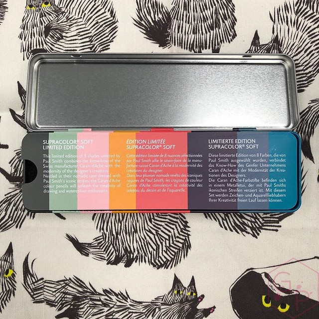
Together, Caran d’Ache and Sir Paul Smith have created a limited edition carrying the designer’s famous signature. For this third collaboration, Sir Paul Smith took pleasure in revisiting the Supracolor® Soft water-soluble colour pencils from Caran d’Ache. Ideal for drawing and watercolours, this creative instrument is greatly appreciated for the brightness and excellent covering power of its colours. For this new and original assortment, Sir Paul Smith has selected eight colours reflecting both his own world and Caran d’Ache one. Presented in a portable metal pencil case dressed with the designer’s iconic stripes, these colour pencils stimulate the imagination with their cheerful and infinitely desirable colours. - Caran d'AcheInteresting points: (points! see what I did there? Totally unintentional. Suave and clever.)
DETAILS OF THE PENCIL
Supracolor® Soft water-soluble pencils
Pencils made from cedar wood; soft, resistant lead with a diameter of 3.8 m
Water-based ecological varnish
Designer’s signature in gilt on the pencils and the pencil case
I have only recently started exploring the world of pencils but from my taste in writing instruments in general, I can feel and smell that these are quality items. They appear attractive to my eye and the finish is so smooth. Just lovely little things overall.
DETAILS OF THE LEAD
Water-soluble, soft and unbreakable lead
Diameter Ø 3.8 mm for clean and accurate lines
Excellent lightfastness
High pigment concentration
TECHNIQUES FOR USE
Watercolour, wash drawing, hatching, superimposing different colours, shading, unlimited blending
Mixed techniques combined with PABLO® permanent pencils, NEOCOLOR® wax oil pastels and gouache
Ideal for large-scale drawings with large areas of colour
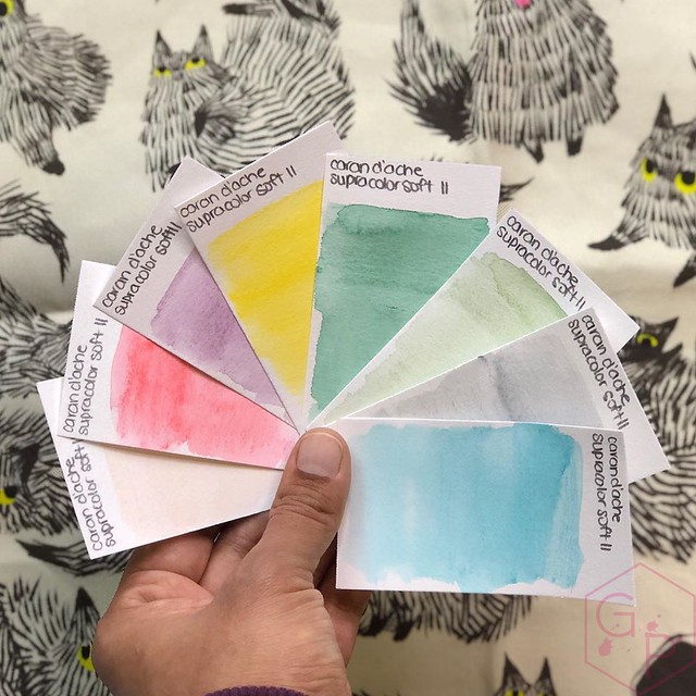
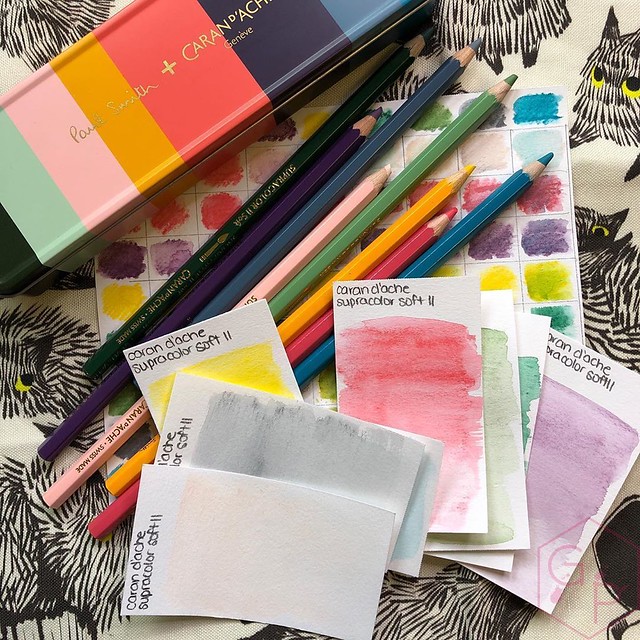
Hm. I guess what I did was...errr. I have no idea actually. Watercolor? Wash? I tried blending with the swatch card, right? I don't know. I don't know what I'm doing. I watched videos and read tutorials on how to make a watercolor swatch card, which is really funny because it still turned out really poorly. I think.
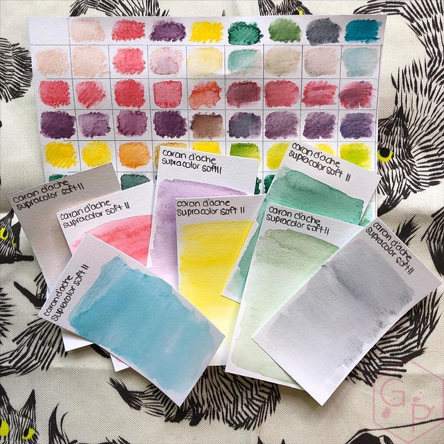
All I did to create these was make a little scribble with varying degrees of pressure and then swished over it with a water brush. Yep. No idea what I'm really doing. I'm sure I could have made these look a lot better but that will come with practice, I hope. What I can say is they were nice and soft and I loved the feeling of the lead on the mixed media paper I used.

Umm... I suspect this didn't come out the way it was supposed to, but I like the colors and it's pretty so sure. Good enough for my first try.
PACKAGING
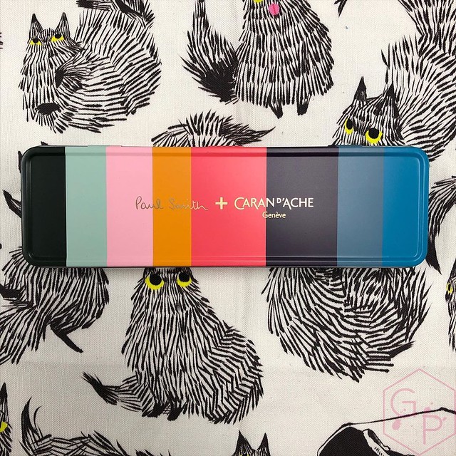
A portable, reusable metal pencil case decorated with the iconic Paul Smith’s “Artist Stripes”
Dimensions: 183 x 54 x 28 mm
A very adorable, very reusable and rather useful tin. Useful at the moment for storing my pencils. The lid is smooth and isn't super noisy to open or close, like some flimsy tins, which can be embarrassing to open in public. Not that opening things in public is an issue right now with the current COVID19 situation, but in the future. I'm one of those people who hate ripping Velcro in public because of the noise. Same thing applies to a noisy tin.
LEGAL STANDARDS
Swiss Made, FSC
"Our colour and writing products are manufactured in our workshops in Geneva since 1915." - Caran d'Ache. Cool, cool. In the case of watches, I understand what the Swiss Made label means but I wonder what it means for these products? I did some searching and really couldn't find anything conclusive I could share with you, so if you have an idea, please do let me know.
What is FSC? "The Forest Stewardship Council (FSC) is an international non-profit, multistakeholder organization established in 1993 that claims to promote responsible management of the world's forests." Thanks, Wiki. It's a good thing. The FSC's stated mission is to "promote environmentally appropriate, socially beneficial and economically viable management of the world's forests". (FSC) I can get behind that.
I am having fun with these pencils so far. I really don't know what I'm doing in terms of the technical use of them, but I am enjoying it. It's a new exploration and I'm having fun. That's all that matters! Have you ever used these (or any other watercolor) pencils? Do you have any tips or tricks you want to share?
Follow Take Note Store on Instagram!
Friday, June 5, 2020
Bexley Golden Age Triangles Arco Verde Celluloid Fountain Pen
Thank you to The Pen Family for loaning me this Bexley Golden Age Triangles Arco Verde Celluloid Fountain Pen so I could share it with you! I liked this one more than I thought I would - my first impressions were that it was silly and too small. It ended up being superb in my hand. Enjoy!
Labels:
18K Gold Nib,
18K Nib,
Bexley,
Cartridge,
Converter,
fountain pen,
fountain pens,
Piston-Filler,
The Pen Family,
Video
Tuesday, June 2, 2020
Black Lives Matter
I've spent some time thinking about what I want to say. I overwhelmed and freaked myself out trying to think of all the right things. I was afraid to post something because I felt like nothing I said would be right enough, be good enough, be helpful or supportive enough. I've done my best. I stopped, I listened, and I learned from my black and brown friends. It has been invaluable - what *I* thought about posting was nowhere near what they need to see. Here is what I learned from those people I respect and love.
1. Don't use the BLM hashtag for #blackouttuesday - it blocks resources with black squares. Information is critical.
2. Donate and share if you can, and if you can't donate, sharing is still helpful. Not everyone is able to help in the same way, so help in the way you can. I know this is not all encompassing, but it's a start.
Black Lives Matter
It's Nice That
3. Compassion, kind words, real change, outreach. These don't cost a damn thing. Throw kindness around like confetti.
4. Listen. Learn. Educate yourself. We have all made mistakes and we can all learn and grow and improve and better ourselves. Don't be afraid to apologize and don't be afraid to do better, be better.
5. Be careful and stay as safe as you can. Look out for yourself and for others.
I will not be silent and complicit.
If you choose to unfollow me, that's fine. You don't need to announce your departure. Please think about why my posting this upsets you enough to want to unfollow.
If you would like to share your experiences, things you have learned, resources, or just share some kindness in the comments, please do so. Please be respectful of others and please please please be kind.
#blacklivesmatter
Subscribe to:
Posts (Atom)


