Friday, July 31, 2020
Pilot Vanishing Point Raden Water Surface Fountain Pen
Thank you to my kind friend for loaning me this pen so I could review it. I really, really did not want to give it back. Also I mention the price in the video - but that's the MSRP. Street price is a little lower around $640USD.
Labels:
18K Gold Nib,
18K Nib,
Cartridge,
Converter,
fountain pen,
fountain pens,
Pilot,
Raden,
Video
Tuesday, July 28, 2020
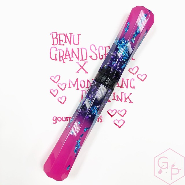
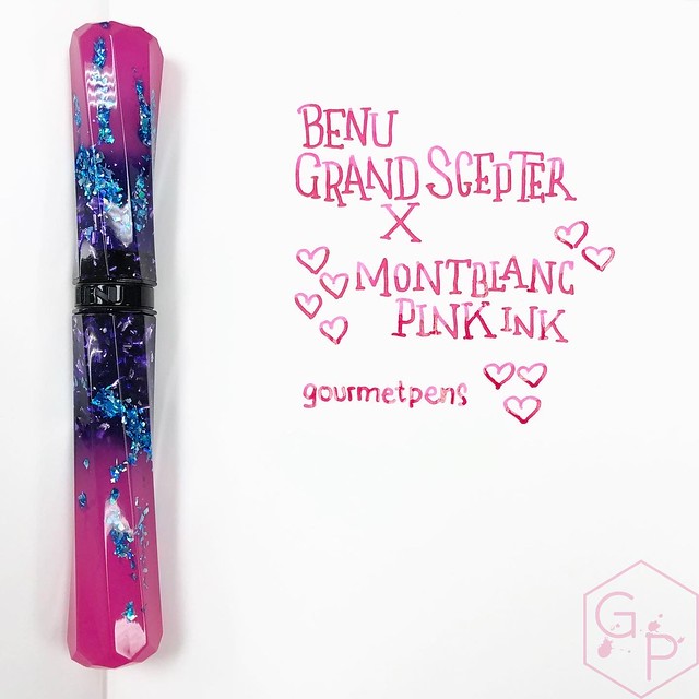
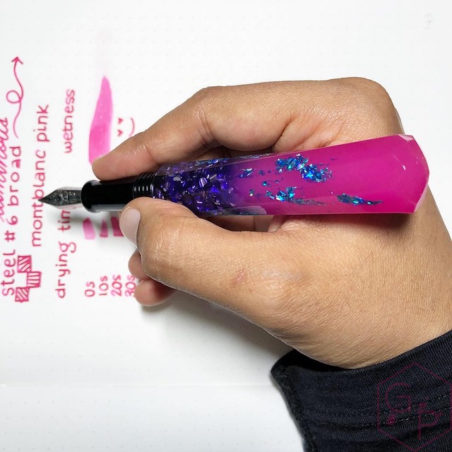
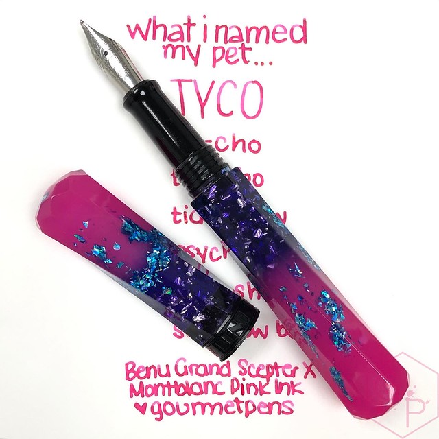
Benu Grand Scepter A Pen that Sparkles and Glows For The Kids In Us! Also for Proper Adults.
Should you get a Benu Grand Scepter fountain pen? Are you into shiny things? Then it's a no brainer!
A few notes about Benu that I think make the company interesting: all the pens are designed and handcrafted in the company's Moscow-based production facilities. They are described as "conceptual writing instruments and desk accessories, which play with streamline shapes and an extensive palette of vivid colors". I can't argue with that - they are absolutely vividly colored and the designs and shapes are intriguing and often unusual.
The team goes through quite a few steps to achieve the final product: sketch and technical drawing, product prototype and pilot model, usability testing, production process mapping, color palette and material, materials testing, production of parts, final polymerization, midpoint quality control, product assembling, fountain pen nibs, and where applicable, hand painting on certain models, hand polishing, finished products packaging, and finished products quality control.
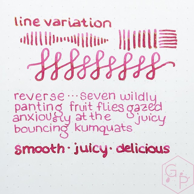
There are a few things I am really pleased with: the packaging is very simple, tidy, and recyclable. They are small cardboard boxes, paper sleeves, and shredded paper inside. It's so minimal and if you do choose to keep them, they stack and store very well. I love the color options because I like colors and shiny sparkly things! This aspect appeals to me. Lastly, I have used over twenty Benu pens over the last few years. Your miles may vary, but I have never had a nib that did not work. Especially the broad nibs - they are exactly my flavor: smooth, wet, juicy, very pleasant to write with, providing killer ink shading. The nibs are firm steel writers and I find they perform really well for hand lettering and round-point style calligraphy.
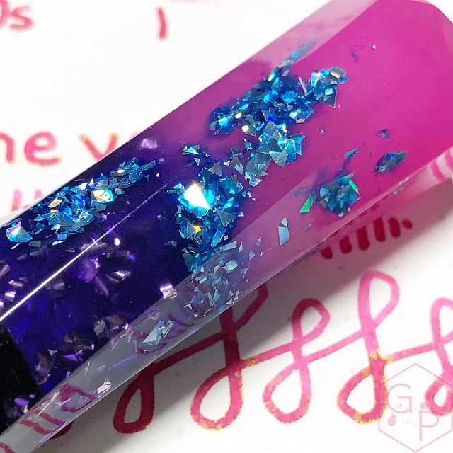
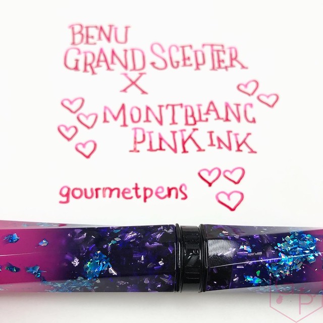
Benu's Grand Scepter series comes in five different colorways and they all have awesome sparkles, cool colors, and magical glow-in-the-dark ends - this is the X colorway. They made it even better by giving them #6 nibs and facets that line up *perfectly*.
It looks like it may be super uncomfortable in hand but it's not. They don't roll, they write super smoothly, they're so easy to clean and take care of, they're pretty robust to carry everywhere, they glitter, and they glow.
Here are a few reasons why you might need a Benu Grand Scepter:
• your budget is $110USD
• you are looking for a robust pen that isn't heavy
• you want a niiiiice smooth steel nib (go for the broad)
• low maintenance standard international cartridge/converter filling system
• you love shiny, sparkly things
• you love details like twisted facets lining up every time
• very comfortable in hand - no slipping, no sliding, no sharp bits
• you want a fun gift for someone (or yourself)
As they are standard international cartridge/converter, it's really easy to work with. Cartridges are a cinch to find and you can choose from a massive range of colors (from Diamine, for example, but in my case here, I used the discontinued Montblanc Pink). The converters are also easy to come by and replace should anything happen to it. This also makes them easy to flush with water when you want to change your ink color.
Grab a Scepter at Pen Chalet!
This is an affiliate link. I receive a wee credit for your purchase but it doesn't cost you an extra penny. Win-win-win.
Thank you to Benu for providing this pen for sharing! I really enjoy their pens and I really appreciate that they keep branching out with designs and colors. I love the diversity and options.
Labels:
Benu Pen,
Cartridge,
Converter,
fountain pen,
fountain pens,
Luxury Brands,
Pen Chalet,
steel,
Steel Nib
Friday, July 24, 2020
Oddly Satisfying Inky Drippings with Fountain Pens
The feeling of a fountain pen nib on paper is soothing and although it seems funny, watching ink flow and dry is strangely meditative. It's a great mindful practice for those who are fountain pen and ink enthusiasts! And for those who like weird puddles of ink sitting on paper.
Clip 1
Pen + nib: Sheaffer Triumph + stub nib (vintage)
Ink: PW Akkerman Hofkwartier Groen
Clip 2
Pen + nib: Waterman 94 + EF flexible nib (vintage)
Ink: PW Akkerman Hofkwartier Groen
Clip 3 - 6
Pen + nib: Guider Super Jumbo + 1.5 mm stub nib
Ink: J. Herbin Emerald of Chivor
Clip 7
Pen + nib: Waterman 94 + EF flexible nib (vintage)
Ink: D. Herbin Diabolo Menthe
Clip 8 + 9
Pen + nib: Waterman 94 + music nib (vintage)
Ink: Montblanc Oyster Grey
Clip 10
Pen + nib: Webster's Flat top + Warranted music nib (vintage)
Ink: Waterman South Sea Blue
Clip 11
Ink: Rohrer & Klingner Verdigris
Music: BenSound https://www.bensound.com/royalty-free-music/cinematic
Labels:
fountain pen,
fountain pen ink,
fountain pens,
hand lettering,
handwriting,
ink,
inks,
oddly satisfying,
Video
Friday, July 17, 2020
Platinum Prefounte Fountain Pen Especially Great for Beginners!
Thank you to Luxury Brands for providing this pen for a review. I actually picked it up in person at the Baltimore Pen Show of 2020 (pre-but-dangerously-close-to-Covid). I think it's a great pen for everyone but it's especially great for beginners, gifting to friends, and for keeping inked forever because it's so handy.
Labels:
beginner,
Cartridge,
Converter,
Eyedropper,
fountain pen,
fountain pens,
Luxury Brands,
Platinum,
steel,
Steel Nib,
Video
Tuesday, July 14, 2020
Blackwing Volume 3 The Ravi Shankar Pencil
Should you get them? Yes!
The latest Blackwing Volumes pencil for June 2020 is the tribute to Ravi Shankar. If you know my preferences, you'll already know I was attracted to them because of the perfect yellow color! There's more to them, of course.
I used to try to avoid getting stationery items that I would have to use up, like special notebooks, limited edition inks, stickers, and pencils. I'm pretty comfortable with things like refillable notebook covers, refillable pens, paper clips, and the like. However, in part of my "COVID19" learning, I am trying to let go of material items and just learn to enjoy things instead of holding on to them thinking that's best for me. Maybe it's best for someone else but I enjoy using these items, even though I know it will come to an end.
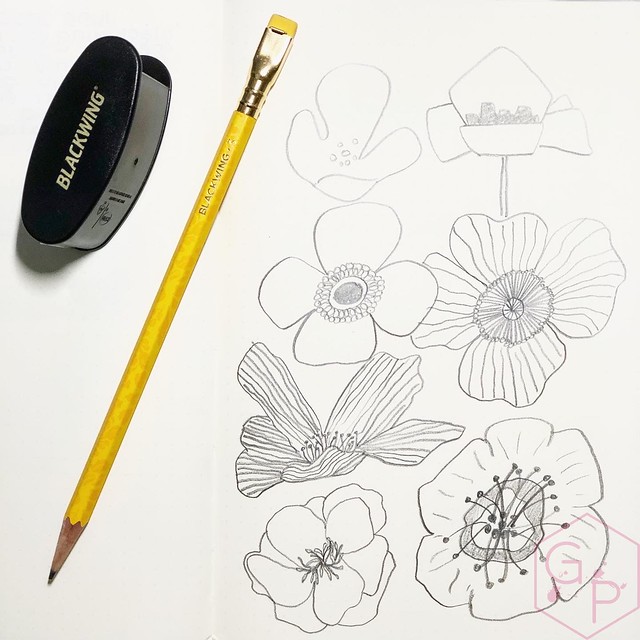
The turmeric yellow is so bright and happy and warm that it's worth it to me. Not only do they brighten up a picture, they brighten my desk! I have been using them to (attempt to) draw florals, which I find very satisfying even if they don't look quite like what they're supposed to. That's ok. It's a global pandemic and I'll draw poorly if I want to. I can't draw real things like kumquats and mushrooms and Link but I can draw lines and put them together and make them look like words and that is exactly why I love hand lettering. And I use this as an excuse to get pretty Blackwing 3 pencils as though I *need* them for my "creations". NEED.
I usually reach for the soft graphite pencils (like the classic black ones) so I only got three of these, thinking the extra-firm graphite would not be my favorite and would last me forever. Well, they're not nearly as firm as I expected them to be. They sharpen easily with the Blackwing Long Point sharpener and I imagine they wouldn't be troublesome with any other quality sharpener. I'm happy about that because I like how they perform. They're very nice for a slightly darker outline and then very light-handed shading/filling.
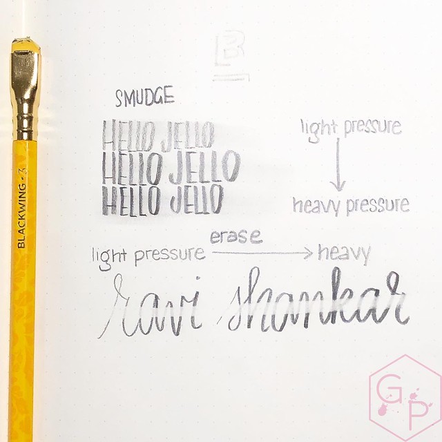
Other than attempting to draw, I am using them for hand lettering. Lettering is what I tend to use my pencils for in general but I wanted to get to know the extra-firm graphite a little better. I think the writing samples came out pretty well.
With one swipe of the eraser, it erases moderately well. Truly, a light hand gives more than enough legibility but sometimes you might want to change it up. A full eraser would certainly do a better job because you could scrub away a bit. Of course, the paper will affect the erasability and smudginess, too. I found it pretty smudgy when using a flatter piece of the tip. This works out well for hand lettering and my poor drawings. I thoroughly enjoy the graphite for practicing control in handwriting - light upstrokes, normal downstrokes. It's somewhat meditative for me, as all writing seems to be.
I have even started forcing myself to use the erasers. They're replaceable and convenient, so it seems stupid not to use them. They look pretty sad once they are nubbed down a little. They are not the best erasers ever but that's fine, they work in a pinch.
Are they worth the price? If you like pencils, sure, why not? Unless you need hoards of them, having a box of 12 or picking up one or two is not unreasonable. Yes, you will use them up eventually, but why not have something pretty?
If you are local, find yours at Take Note (which is where I found mine)!
The latest Blackwing Volumes pencil for June 2020 is the tribute to Ravi Shankar. If you know my preferences, you'll already know I was attracted to them because of the perfect yellow color! There's more to them, of course.
A tribute to the Godfather of World Music.I didn't even know Blackwing supports different foundations in accordance with the pencil's tribute. That's a beautiful initiative and certainly adds that little something special to sway me. If I needed swaying. Which I don't. But if I did. If this is important to you, splurging on Blackwing pencils might be something that appeals to you and that you feel comfortable doing. If it is not something near and dear to your heart, no big deal either. I think it's one of those intangible touches Blackwing is really good at that makes me want to stick around and support them when I can.
In June of 1966, George Harrison met maestro Ravi Shankar in Bath, England. Harrison asked Ravi to teach him how to play the sitar, a task Ravi agreed to only after considerable hesitation. Their collaboration resulted in an explosion in the popularity of classical Indian music and instrumentation in the United States and around the world.
Harrison called Ravi “The Godfather of World Music.” Trained in both traditional Hindustani music and classical European theater, Ravi was an artistic genius who influenced countless artists around the world. He infused structure and spectacle into Indian instrumental music and introduced the West to Indian traditions like meditation. He was a true ambassador of India’s rich culture of mindfulness that extended well beyond the stage.
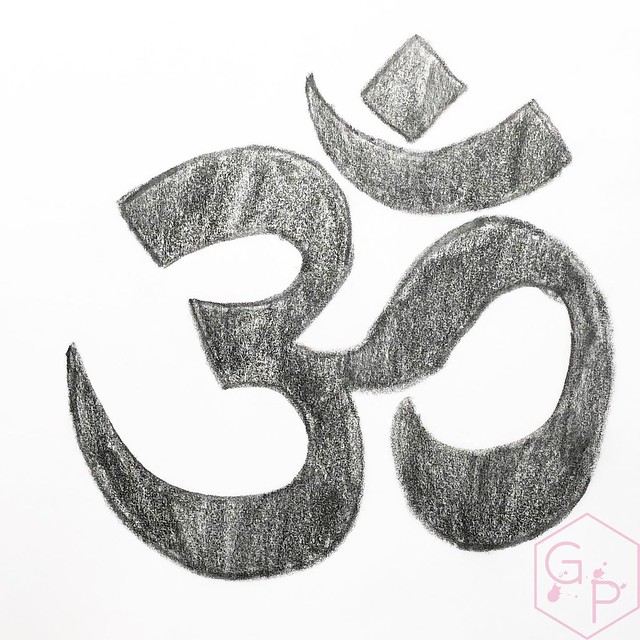
The Blackwing 3 is a tribute to Ravi Shankar on his 100th birthday. It features a matte turmeric finish accented with a pattern inspired by one of Ravi’s iconic sitars. The pattern prominently features the ॐ (Om), a sacred Sanskrit symbol with three phonetic components that correlate to the waking, dream, and unconscious states of being. The Om was an important symbol to Ravi, and served as a constant reminder of the contemplative, spiritual nature of his music. Translated from Hindi, Ravi means “sun,” and this pencil’s gold imprint and ferrule are a meditation on the light he brought into the world through his music and spirit.
We’re excited to announce that a portion of every pack sold will benefit the Ravi Shankar Foundation and their mission to “preserve the diversity of cultures and richness of their arts.” Learn more at RaviShankar.org. - Blackwing
I used to try to avoid getting stationery items that I would have to use up, like special notebooks, limited edition inks, stickers, and pencils. I'm pretty comfortable with things like refillable notebook covers, refillable pens, paper clips, and the like. However, in part of my "COVID19" learning, I am trying to let go of material items and just learn to enjoy things instead of holding on to them thinking that's best for me. Maybe it's best for someone else but I enjoy using these items, even though I know it will come to an end.
The turmeric yellow is so bright and happy and warm that it's worth it to me. Not only do they brighten up a picture, they brighten my desk! I have been using them to (attempt to) draw florals, which I find very satisfying even if they don't look quite like what they're supposed to. That's ok. It's a global pandemic and I'll draw poorly if I want to. I can't draw real things like kumquats and mushrooms and Link but I can draw lines and put them together and make them look like words and that is exactly why I love hand lettering. And I use this as an excuse to get pretty Blackwing 3 pencils as though I *need* them for my "creations". NEED.
I usually reach for the soft graphite pencils (like the classic black ones) so I only got three of these, thinking the extra-firm graphite would not be my favorite and would last me forever. Well, they're not nearly as firm as I expected them to be. They sharpen easily with the Blackwing Long Point sharpener and I imagine they wouldn't be troublesome with any other quality sharpener. I'm happy about that because I like how they perform. They're very nice for a slightly darker outline and then very light-handed shading/filling.
Other than attempting to draw, I am using them for hand lettering. Lettering is what I tend to use my pencils for in general but I wanted to get to know the extra-firm graphite a little better. I think the writing samples came out pretty well.
With one swipe of the eraser, it erases moderately well. Truly, a light hand gives more than enough legibility but sometimes you might want to change it up. A full eraser would certainly do a better job because you could scrub away a bit. Of course, the paper will affect the erasability and smudginess, too. I found it pretty smudgy when using a flatter piece of the tip. This works out well for hand lettering and my poor drawings. I thoroughly enjoy the graphite for practicing control in handwriting - light upstrokes, normal downstrokes. It's somewhat meditative for me, as all writing seems to be.
I have even started forcing myself to use the erasers. They're replaceable and convenient, so it seems stupid not to use them. They look pretty sad once they are nubbed down a little. They are not the best erasers ever but that's fine, they work in a pinch.
Are they worth the price? If you like pencils, sure, why not? Unless you need hoards of them, having a box of 12 or picking up one or two is not unreasonable. Yes, you will use them up eventually, but why not have something pretty?
If you are local, find yours at Take Note (which is where I found mine)!
Labels:
art,
Blackwing,
office supplies,
pencil,
pencils,
stationery,
Take Note,
Toronto
Friday, July 10, 2020
Oddly Satisfying Sexy Flexy Handwriting
It is a roasty toasty day out here in Toronto so I thought to myself, Ziza, what better way to spend such a day than to be a blob in front of a fan in a pile with no pants on while you assemble some super hot and bothersome sexy flexy vintage nib video footage? ... There are better things, in fact. Like a scoop of ice cream in a waffle cone, chocolate chip cookie dough, being in the ocean when it's this hot out, a gooey half raw cookie fresh from the oven but definitely without raisins in it. There are more things, but in the meantime, I hope this one tickles your fancy.
Pen: Webster's Flat Top in green jade (vintage)
Nib: Warranted music nib (also vintage)
Ink: Waterman South Sea Blue/Obsession Blue. Whatever they call it now. I wish they'd stop renaming it and Obsession Blue is a stupid name
Music: BenSound
Pen: Webster's Flat Top in green jade (vintage)
Nib: Warranted music nib (also vintage)
Ink: Waterman South Sea Blue/Obsession Blue. Whatever they call it now. I wish they'd stop renaming it and Obsession Blue is a stupid name
Music: BenSound
Tuesday, July 7, 2020
Sailor's Sailor Ocean Blue Ink
For the past 15 years, Sailor has been actively holding Ink Studio in-shop ink blending events all throughout Japan. These sought after events have always been a success with Japanese consumers lining up to have custom ink colors blended by their famed Sailor ink blender Osamu Ishimaru. To mark Sailor Ink Studio’s 15th year milestone - and to thank their loyal followers - Sailor will be releasing a special commemorative edition bottle ink – the Sailor’s sailor. This special edition bottle ink was originally intended to be sold solely within the Japanese domestic market, however Sailor has decided to extend the availability to North America as well. - Wonder PensSailor's Ink Studio line comes in those tiny little bottles with crazy cool colors named after numbers, which is incredibly frustrating when there are 100 colors and you have to remember which ones you like (no. 1 - 100, basically). The names are numbers. They're beautiful, they're expensive, and I still want most of them. I have resigned myself to having four bottles in total. That might sound like a lot but it isn't when you consider most of my nibs write 1ml/minute.
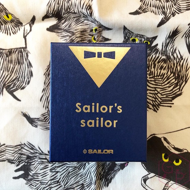
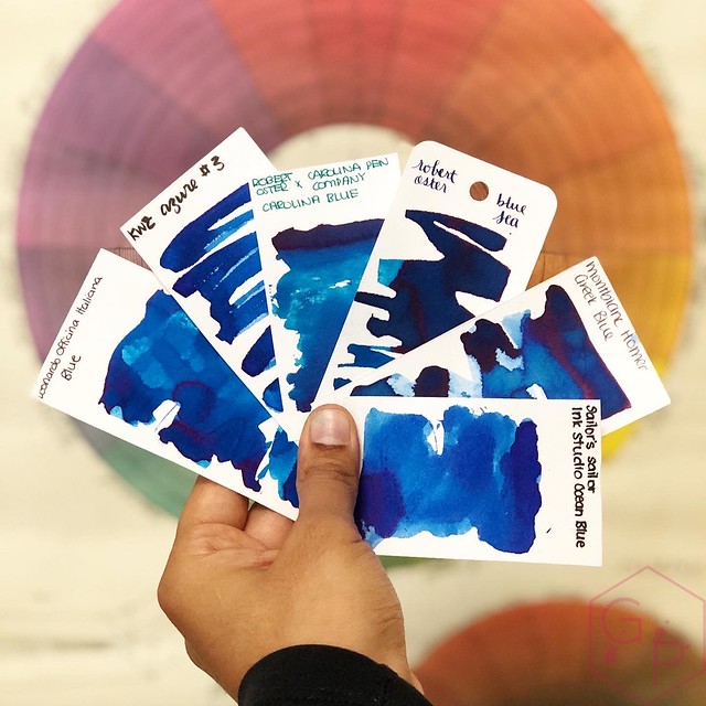
The Sailor’s Sailor Ocean Blue has some notable differences from the regular Ink Studio line up: the bottle is larger, it's not just a plain white box, the ink has a name, and in comparison to the bottles I own, the color is pretty chill. The solid little box is really cute and while I'm not usually someone who likes presentation, this one is well done and is not excessive. In fact, I'd keep the little box and I'd reuse this bottle for sure.
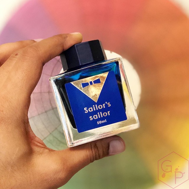
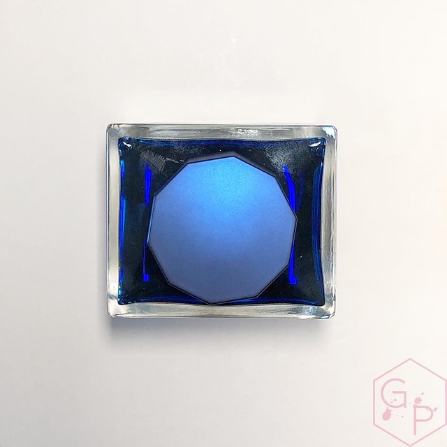
The bottle is solid clear glass and holds 50 ml of ink with a little blue label and gold bowtie. The cap is faceted and it's really easy to get a grip on and thus, open. It's a pretty matte metallic blue-purple that is sort of iridescent? It's hard to describe so you can check out the picture, but overall, the presentation is really nice. The bottle is pretty heavy and is very stable on the desk. It's easy to fill from and because it's stable, there is no risk of tipping.
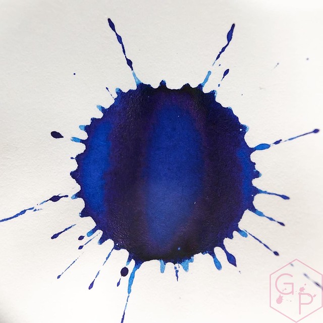
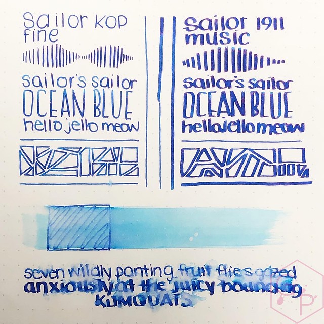
It’s unusual for Sailor to have an ink in the Studio line up that isn’t 3429234 colors in one. Sometimes you just want a pure color. It's definitely work appropriate and I don't think it is boring. It has a surprising amount of water resistance, which makes it even better. It's a clean color that is not super duper saturated so I have not found it difficult to clean. If you have greasy residue inside a clear pen (for example, from a piston), the blue can cling to the residue but I was able to clean it out using a Q-tip.
Here's where I can shock you: this is probably the first ink I've ever used where I actually prefer it in the fine nib I inked instead of the super wet juicy music nib. Why? The music nib is dare I say almost too wet and just floods the color out. The fine nib has medium flow so I could see the shading better and it has a strange ethereal delicacy to it, like you're writing on tracing paper. It's really interesting.
I wasn’t planning to get this ink but the bottle was cute and a friend asked if I wanted to split some (in other words, this sad soul bought the bottle and I said oh can I just borrow this for pictures? ... *siphons ink into sample vials*). Do you need it? If you need another blue, absolutely. It’s a pretty decent one. If you have 29384029348 blues, I’d suggest sharing it with a friend. You’ll have to share custody of the really cute bottle.
$55CAD at Wonder Pens
Last but not least my friends, if you enjoy these posts and/or my videos and you would like to support me in some way, please check me out on Patreon!
Labels:
fountain pen,
fountain pen ink,
fountain pens,
ink,
inks,
office supplies,
Reviews,
Sailor,
stationery,
Wonder Pens
Friday, July 3, 2020
Montblanc Meisterstück PT 146 Solitaire Doué Le Petit Prince Aviator
Thank you to Appelboom for loaning me this pen. With the discount code 'friend' you can get 10% off your purchases at Appelboom, but unfortunately this excludes Montblanc, as per their rules. Buuuut if you like this particular pen, you can find it here!
Labels:
18K Gold Nib,
18K Nib,
Appelboom,
Montblanc,
Piston-Filler,
Video
Subscribe to:
Posts (Atom)


